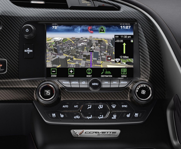
It goes without saying that the automotive industry is highly competitive. Manufacturers are constantly innovating, promising to deliver the ‘latest’ technology. Yet throughout all of their advancements there is one fundamental component which so far no one has managed to nail down, the in-car user interface. The technology available within contemporary cars is constantly evolving, from complex sound systems to zoned climate controls, connected smartphones to car performance settings.
So what’s the problem?
Well thanks to a melting pot of showroom semantics, company politics, industry regulations and market competition the boundaries of in-car experiences are more blurred than ever. Committee groups, partners and organisations independent of the manufacturer contribute to a convoluted design process resulting in delays and workarounds. This only adds to the cost of developing these systems, which is not cheap; manufacturers want bang for their buck without compromising speed to market. Good value for money lies in a system’s flexibility. A system that can be adopted or adapted across a model range or even multiple brands represents profitable gains to the manufacturer. However in the world of in-car UIs one size certainly does not fit all.

Whilst these factors cumulate to what is an intricate design challenge, and I am sympathetic, sometimes bad design is simply bad design. There is no excuse for illegible text or offensive iconography. So far the automotive industry’s eagerness to create innovative hardware has not transferred to their software or UI experiences, however could the tide be turning?
Enter the giants
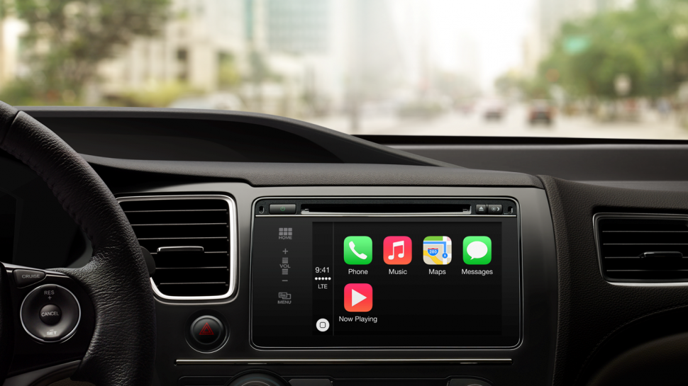
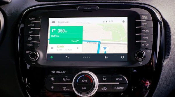
Several technology companies, principally Linux and Windows, have tried to enter the automotive industry in the past. However the latest entrants, Apple and Google, are working to transfer their experiences with desktops and handhelds to the world of automotives. Whilst it is probable that the future of both companies lie in more advanced driverless, electric cars, their immediate interests lie firmly in UI development, through the release of Apple Carplay and Android Auto. These tech giant’s latest developments are logical: harmonising the most commonly utilised features of a car UI, the infotainment system, with the smartphone sat in your back pocket. So it’s a match made in heaven right?! Not so fast.

Apple and Google have exploited their experience to provide streamlined systems which advocate ‘Slippy’ user experiences, facilitating understanding through short, abrupt interactions. On-screen content is stripped to the essentials and interactions are completed through voice recognition. For example outgoing messages are composed through voice control and incoming messages are read aloud rather than displayed. In other words content is glance-able, deterring user engagement and facilitating quick task-based user requirements. Whilst providing aesthetic and holistic improvements on existing native systems, their functionality is limited to media playback, communications and navigation. It would therefore be silly to suggest that most contemporary cars do not already provide access to,at the very least, basic forms of these features as part of the broader in-car UI.

Therein lies the problem. The double edged sword of the current in-car experience. The majority of driving features are still designed and determined by the car manufacturers, varying drastically across the industry. The services provided by both Apple and Google currently only cater for a fraction of what is expected from today’s UI’s. In this respect their systems are merely fronts, an afterthought, concocted from a sales and marketing strategy. From an UX perspective the seam between the native car operating system and Carplay/Auto will show. Furthermore the accumulation of analytical data and further design innovation by Apple and Google could heighten this disparity with each periodical update. If car manufacturers struggle to keep up with this pace, the divide could become even more substantial in time. Ultimately, the infotainment system will feel like an iPad neatly stuck to the dashboard rather than an actual part of the unified experience.
A different direction
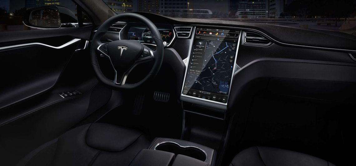
Since its conception in 2012 the release of Tesla’s ‘Model-S’ has made a significant impact on the automotive industry. Its creator Elon Musk has altered the general perception of the electric vehicle, transforming it from lab rat to poster boy. The standard in-car UI concoction of buttons, knobs and sliders are replaced with a single 17 inch touch display with an interface following the familiar touch paradigms of tablets and smartphones.

The real difference compared to the Carplay and Android Auto approach is that Tesla has developed its own operating system specifically for the full in-car UI. Furthermore, it supports over-the-air updates from stored WiFi connections and nearby Tesla locations. It is expected that the current interface, much like a smartphone or tablet, will alter throughout its lifespan. Interface optimisation will ultimately occur through style revisions, application development and new feature releases. A constant failing of the automotive industry has been its inability to keep pace with the technology around it, such as the smartphone. The general product life cycle of a handhelds is drastically shorter than that of a car. A native OS like Tesla’s, which can adjust to bugs/issues and deviations in trends through software development, can provide stakeholders with the flexibility they so desperately desire.
Tesla’s in-car UI is by no means perfect. It is overwhelmed with new non-essential features, such as web-browsing, that do not even relate to the driving experience. People should not be encouraged to browse the web as they drive, so why would they choose the in-car UI over a smartphone or tablet when not driving? Furthermore the current touch screen does not provide the user with any form of tactile feedback, as found in rudimentary physical controllers. Tactile feedback provides users with muscle memory anchoring points, making it possible to reach out and, for example, adjust the air conditioning dial without breaking your focus on the road. The distinct lack of such feedback on touch screens inevitably leads to users fishing through menu systems rather than concentrating on the road.
However a convenient solution to these issues could be only an update away. Styling alterations, bug fixes and significant re-imagining of interactions could resolve current issues. For example the current tactile feedback issues could be resolved via an implementation similar to Matthaeus Krenn’s New Car UI. Here Matthaeus suggests a ‘slippy’ experience specifically tailored towards the demands of driving by utilising gestures as opposed to skeuomorphisms of physical controllers or ports of interaction paradigms from smartphones and tablets. As the gestures are not location dependent, and therefore can be applied anywhere on the touch screen, there is no requirement for any specific form of tactile feedback.
Despite it’s currently less-than-perfect in-car UI, it is undeniable that Tesla is leaving its mark on the automotive industry and could only be an update away from market superiority. The seeds of a great integrated experience is there, but it is evident that the optimum solution is still a few iterations away from being defined and standardised. In this regard Tesla has the capability to facilitate fresh content long after the customers initial excitable honeymoon period has past.
Summary
Currently the in-car experience is in limbo, an awkward adolescence phase struggling to find its feet. Whilst the emergence of Apple Carplay and Android Auto could perhaps go some way to assist in the short-term it should not be seen as an answer for the long term. The responsibility for these systems lies at the feet of the large automotive manufacturers (amongst whom Apple and Google may eventually count themselves). However Apple and Google’s immediate presence already places a spotlight on the world of in-car UI’s, providing an impetus for improved future conceptions. The sizable 3rd party followings of both Apple and Android could see a raft of innovative developments, which have so far by passed the automotive community.
So what can be done?
Learn from software development
Software development is a volatile sector: in order to remain on the forefront manufacturers must adapt to its pace. Bug fixes, feature developments and iterative updates assist software development companies to maintain an agile approach, adapting to industry changes. In this regard Tesla has not only stolen a march on its direct competitors within the electric vehicle market, but the industry as a whole.
The UI is part of the experience
Manufacturers must encourage the development of on-screen content and recognise that the in-car experience plays a significant role in defining the broader product and brand. Manufacturers must do away with their ‘star-trek-esk’ fantasy concepts, and focus on software design and development through suitable processes and management structures. Whether we like it or not Apple Carplay and Android Auto are currently the must have feature of any contemporary car. Their introduction has already sparked a bidding war, with automotive companies starting to pick sides. However these systems should not be seen as substitutes for a well designed native system that integrates the entire in-car experience and empathetically portrays a brand’s experience.


