As interns at the Newcastle office we were tasked with creating an interactive desk directory to allow new employees to better acquaint themselves with their building and colleagues, with the speculative goal of replacing the company-wide internal phone directory. The original brief specified we should present a graphical view of the office layout generated from an existing office plan stored in Google Sheets.
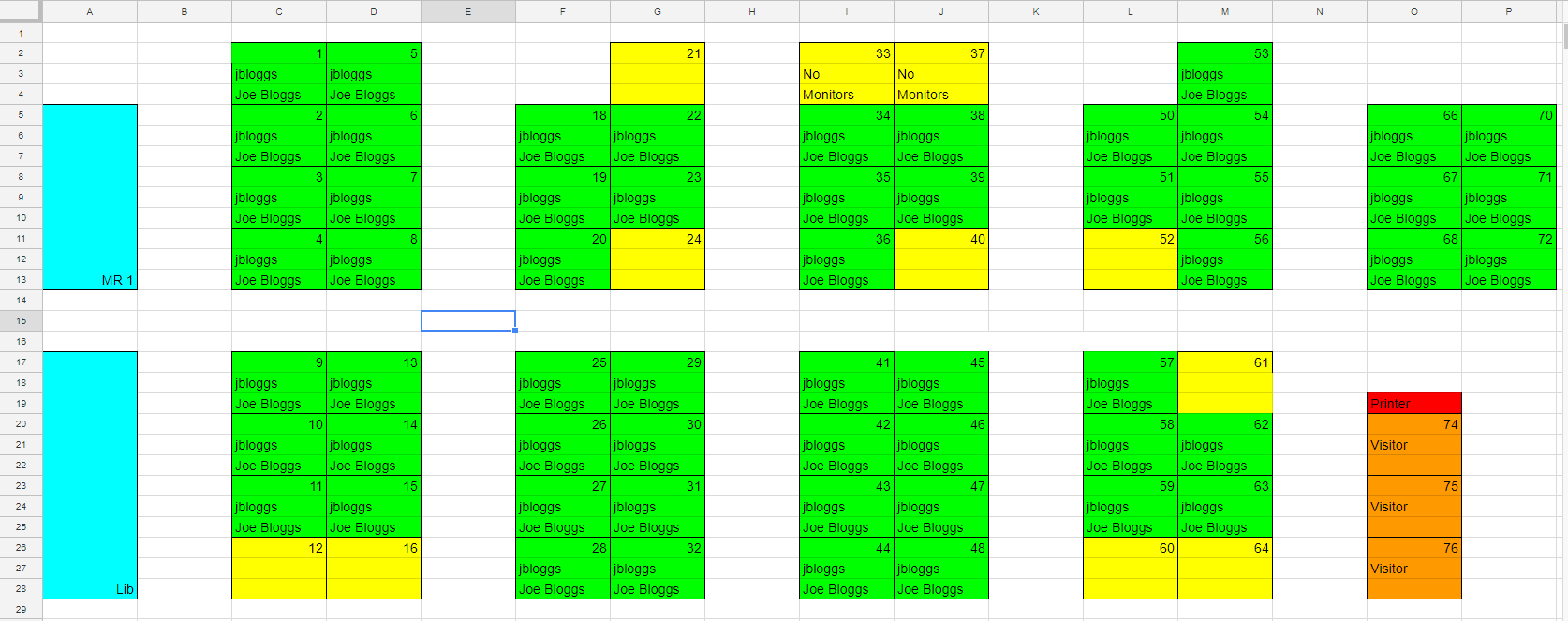
The project brief required the data to come from Google Sheets so we had to create a schema for the source spreadsheet. We decided that the cell colour would define the type of data that the cell represents (Desks, Walls, Rooms, etc.) as it would make the different data types visually clear in the spreadsheet, reducing the chance of formatting errors. The schema was designed to be usable both by the people editing the sheets and by the spreadsheet parser. Only relatively minor changes were needed to the established office plan sheets.
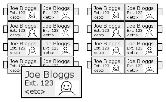
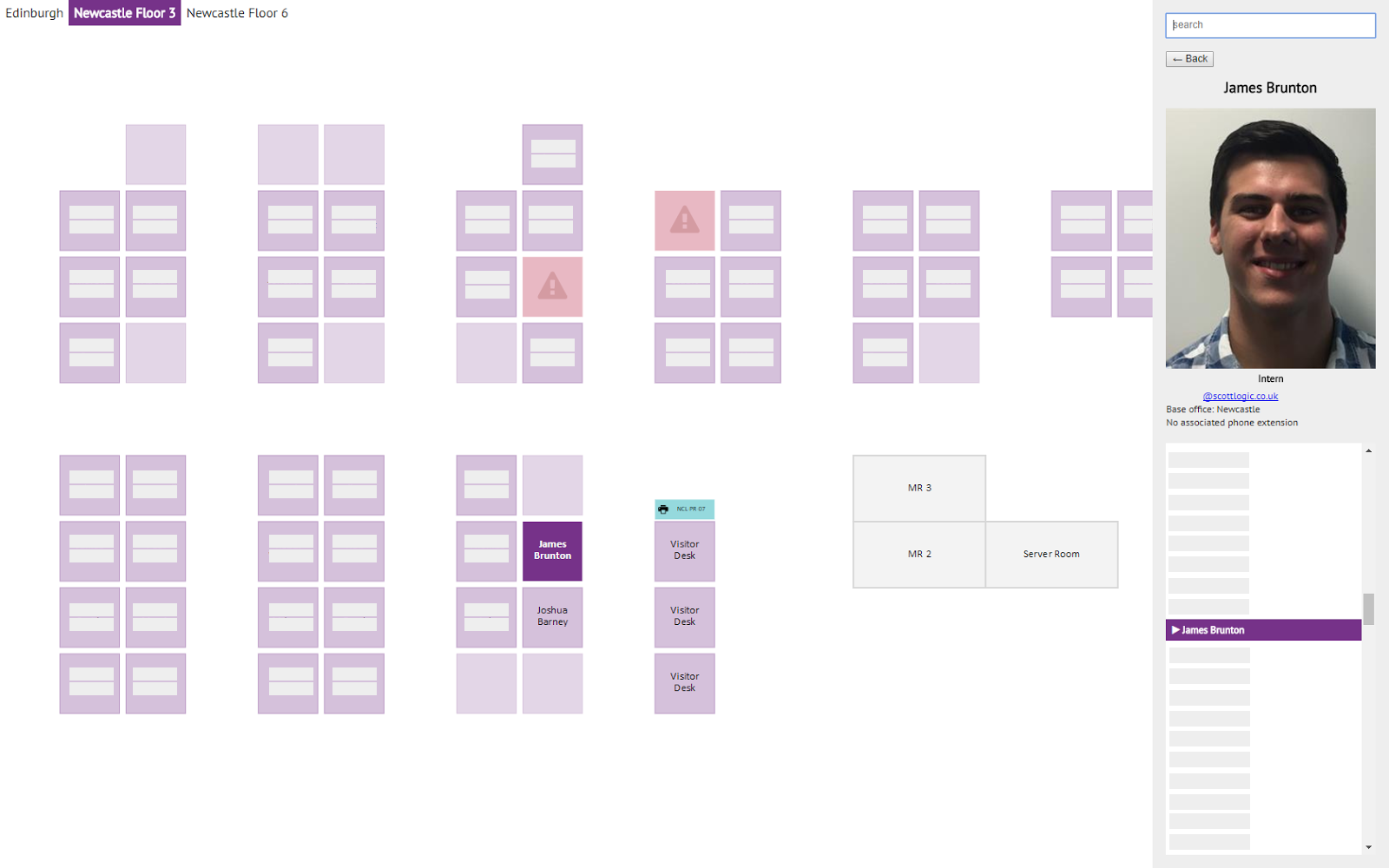
In contrast to the initial mockup which displayed employee details such as names, photographs, or phone extensions directly on the desk plan, we made a decision early on in the development process to use a sidebar for this information. This made the desk plans more compact, and more importantly better supported the use-case of finding user details across offices, a flow likely to be common if our app replaced the existing phone directory.
By the end of the project we had successfully created a graphical desk planner with animated dragging and zooming capabilities, support for multiple offices, and the ability to display a variety of different office landmarks.
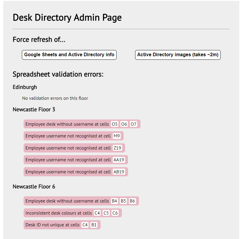
We also felt strongly that since formatting errors were likely (due to the Google Sheets backend), we needed good support for error handling. Because of this, we designed the sheet parser to track any errors it found (such as incorrect usernames or missing data) and send specific cell references to the frontend so an administrator would be able to easily locate the errors in the spreadsheets.
Which technologies did we use?
The frontend of the app was written using a fairly standard stack: React for rendering UI, Redux for state management, and Redux Saga for handling async control flows ergonomically. Styled Components were used to encapsulate styling and nearer the end of development React Router was pulled in so we could add the admin page.
Neither of us had much experience with C# or the .NET Core framework before the start of the internship but we decided to build the backend with them since they were popular technologies around the office. We found learning the core of the language fairly easy due to its similarities to Java (which we had both used), although becoming familiar with the libraries we were using took longer.
We self-hosted Concourse as our continuous integration (CI) system, which ran tests inside of Docker containers. Concourse was configured to listen for pull requests on GitHub and when it found one, it would run the tests and reply back with status information. This ensured that we were always aware of whether our work had caused breakage. There were multiple times this prevented us from merging broken code into the main branch.
At the start of the internship we had very different levels of experience with web development because of the difference between the focus of our university courses. One of us had been exposed to a reasonably large amount of web development while the other had not been exposed to any. The first two weeks of the internship were spent doing a HTML5 training course, which greatly evened out the knowledge gap between the two of us.
For the next several weeks after the training, we split the workload so that one of us was doing all of the frontend and the other was doing all of the backend work. This worked well initially but we both wanted to experience the opposite perspective. After putting off switching several times, we finally forced ourselves to swap ends about halfway through the internship. This dramatically reduced productivity for a couple of days, but by the end of the week we were developing at full speed again with the advantage of having both parties able to contribute to all parts of the codebase.
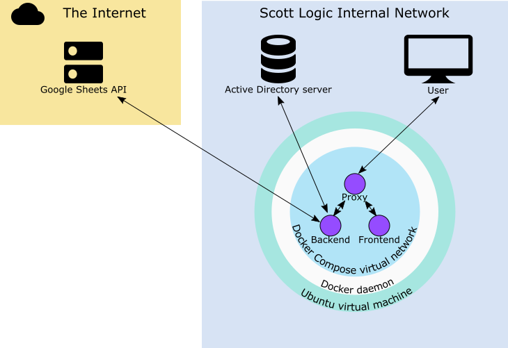
In order to deploy the components of our app, we wrote a docker compose file which built our code from a fresh git clone and used a reverse proxy to run the backend and frontend on the same URL. When it was time to launch, we copied over the required credentials and set our app running on an internal Ubuntu VM.
Real world experience
We used many development tools and methodologies that are used in real development environments, such as Scrum, Git and CI. Every week we would gather a backlog of tasks to be done and then predict how long they would take with our technical mentors. This was useful because it kept everyone involved on the same page about what we were working on and how the project was progressing, as well as revealing hidden assumptions and information we had. Both of us had used Git casually before but the intensity of the project forced us to adopt a more structured approach to working together – Git Flow’s feature branches. This helped us avoid breaking each other’s code although small merge conflicts were inevitable in some cases.
We decided to implement multiple testing strategies because we both thought it was an area which we lacked experience in. By the end of the project, we had a mix of unit tests with jest, integration tests, (combining redux-saga-tester for mocking the store, nock for mocking the network, and enzyme for navigating, interacting with, and asserting on the results of component renders), and automation tests with nightmare.js which would prevent code from being pushed to the main branch if opening the app caused errors to be shown in the browser console.
Retrospective
Neither of us had thought deeply into what we thought the internship would be like, but there were still things that we didn’t expect. We were surprised by how much influence we had over the project’s direction. In the planning meetings, the project leaders and us would decide on the tasks to be done by the end of the week, but beyond that we were largely allowed to split up the workload between us however we saw fit. This was a very positive experience for us because it really showed that we were an important part of the team, rather than just being dictated to.
We also really grew to understand the importance of good demonstrations to our customer. While it might seem like a good idea to show the customer half finished features in order to solicit feedback, we realised this was sometimes counter-productive since it can give a false impression that the feature was closer to being finished than it actually was.
We were both hoping to be exposed to a real development environment and learn good practices for software development and the internship definitely provided us with this experience. We were surprised how fast the internship flew by, and now better appreciate the time cost involved in getting seemingly simple software components to a production standard.
Other intern projects perhaps sound more exciting as an elevator pitch, but ours had real customers and is really going to be deployed, so this forced us to care deeply about any potential shortcomings that might inconvenience them. As students, the chance to work on something that mirrors the process of client projects was invaluable, and we’re deeply grateful to Scott Logic for mentoring us through this experience.


