In 2016, Yahoo disclosed that it had two data breaches, one in August 2013 and another in late 2014. It faced several lawsuits for failing to disclose them earlier and spent $80 million in settlement. The General Data Protection Regulation (GDPR), which came into force in 2018, imposes fines on breaches resulting from inadequate security, and penalties on companies that fail to report data breaches within 72 hours. Companies are now more than ever urged to identify cyber risk and enhance their security.
Protecting users’ privacy and security is often seen as a task for developers. However, UX designers can work alongside developers and play a role in that. In this post, I present a few ways in which designers can help users protect their data.
MEASURES TO ENHANCE SECURITY
There are simple measures we can take to enhance the security of an application. When users enter a wrong email, password, or email-password combination, as designers we need to provide them with feedback about the error in the login credentials they entered. We have to be wary of not revealing information that could allow hackers to access users’ account. What should the error message say?
1. “The password you entered is too long/should not contain letters.”etc.
This type of feedback jeopardizes the user’s security because it confirms that the username is correct and hints on what the password might be.
2. “The password you entered is incorrect”
This message confirms to the user that the username exists in the system and that the error is in the password.
3. “No account exists for the email you entered”
This message is very common, especially when you try to recover a lost password. While you might think it is harmless, it can actually be giving too much information similar to the second example. Imagine trying to log into a dating site using someone else’s email. This message would allow you to know whether the user has signed up to the site or not, which is information that the user might want to keep private. Using a username rather than an email can help protect user’s privacy in this scenario.
4.“Wrong email password combination”
This message indicates to the user that there is an error in either the username or the password without giving any details about where the error might be.
Ensure that error handling doesn’t compromise a site’s security
Choosing the appropriate message depends on its context. If you are logging in to your email account, the third option would be acceptable. If you are logging in to a bank account, it wouldn’t be. Good UX Design lies in finding the balance between providing users with a convenient UI and securing their data.
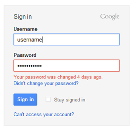
Gmail error message after you’ve recently changed your password
A good example is the message Gmail displays when you’ve recently changed your password but entered an older one. It provides useful information without revealing too much to make us vulnerable to hackers. Slack takes a different approach to solving the issue of forgotten passwords, and offers an alternative way for logging in. It sends a link to your email, which you click to login.
Some applications like LinkedIn track unusual behaviours and prompt you with a security precaution to reset your password.
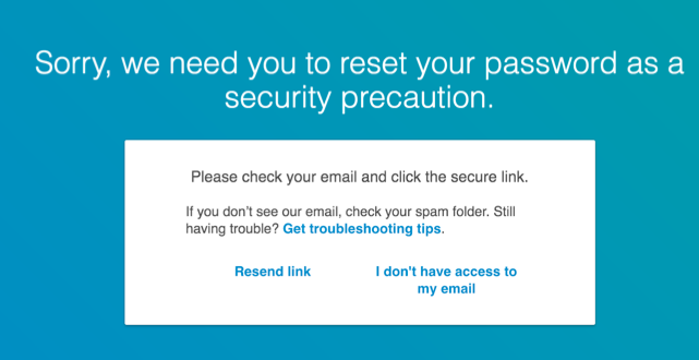
LinkedIn prompts you to reset your password after unusual activity is detected
Gmail does something similar. If you suddenly start deleting a large number of emails, Gmail locks you out of your account temporarily because it recognises that as an unusual behaviour. Some sites block your account if you unsuccessfully attempt to sign in more than 3 times, and some don’t allow you to try again until a few hours later. While it is inconvenient for users to be locked out of their account, it increases their trust in the security measures implemented.
Temporarily lock down an account and design quick ways for users to change its password if it has been compromised
You can also take softer security approaches. Facebook, for example, gives you the option of being notified whenever your account is accessed from a new computer. You can ban any login from a machine you haven’t previously verified or added to the list of authorised devices.
Design sign up flows with two-factor authentication
There are measures that users can take to increase security such as not reusing the same password, using two-factor authentication, using a username rather than an email, choosing a strong password, or often changing their password. However, we can’t rely on users to do that. The design should help users make these choices by setting these as requirements in the sign-up flow.
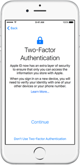
iPhone’s Apple ID two-factor authentication
In some cases, users put their data security at risk without realising it. Have you ever had to give details about yourself on the phone (your address, NINo, etc.) while somewhere public? To help users avoid doing that, you can enable keyboard entry and verification while users are on a call, so that they can securely enter the information needed to verify their identity without revealing it to people around them.
Enable keyboard instead of voice input on calls where users need to provide sensitive data
Having to authenticate who you are in a public space makes you vulnerable to identity theft. A similar situation we face is having to unlock our mobile device in public. When using a passcode or a lock pattern our data can be exposed. Using biometric authentication is better in that scenario but presents greater risks if hackers get hold of it.
ENABLING DATA TRANSPARENCY
Protecting users’ security goes hand in hand with protecting their privacy. Companies need to be transparent about the information they are collecting from users and how they intend to use it.
If you’ve used Whatsapp messenger, you might have noticed that you are able to see the profile picture of contacts you don’t know. This happens when one of your friends on WhatsApp changes their phone number. Mobile providers recycle numbers and your friend’s old number can be reassigned. You are able to see the profile picture of the new owner of the number if they have chosen to share it with everyone. However, your photo would be shared with the new owner even if you have only chosen to share it with your contacts. The application does not notify you about your friend changing their number and therefore you keep that number in your address book giving access to your profile picture to someone you don’t know. You have to manually delete that contact from your address book.
Facebook users might not know that their profile picture is always public even when they set it to private. They can stop users downloading it, liking it, or commenting on it, but any user can view it. When you enter a random username on Facebook’s login page, the application suggests some random user’s name and shows their profile picture.
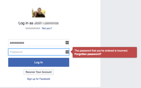
Facebook, Random username and password entered (picture and name have been blurred)
Facebook has also recently faced a class action lawsuit for allegedly allowing the misuse of its users’ personal data by Facebook clients involved in political campaigns. Users were unaware of how the data they were sharing was being used.
Most of us agree on the terms and conditions of sites without reading them. Regulations like the GDPR make that information available but UX Designers have a role to play in making it more understandable and digestible by users.
Ensure transparency in what user actions entail
Sites now show a message if cookies are being collected. Most users don’t know what that means. Dropbox does a good job in making this information clearer. They link to a page explaining what it means and give examples on what they use cookies for.

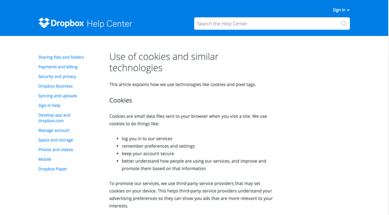
Dropbox cookies message
An interesting project I came across and that helps users learn more about how they’re data is being used is the Data Selfie project. It is a browser extension that allows you to track the information collected about you while you are using Facebook and what machine learning algorithms would predict about your personality. It uses data like the time you spend on a page or your likes to predict your preferences and build your profile.

Data Selfie prototype
Users should not have to download plugins like this. Data transparency should be inherent in the sites we use. Instagram, for example, suggests people to connect with and displays what the suggestions are based on. e.g. “based on likes”, or “because you are friends on Facebook”. Getting a view of what’s happening behind the scenes can help establish trust.
UX Designers can help users protect their data by designing experiences that encourage them to follow good security practices, and informing them about how their data is being used.


