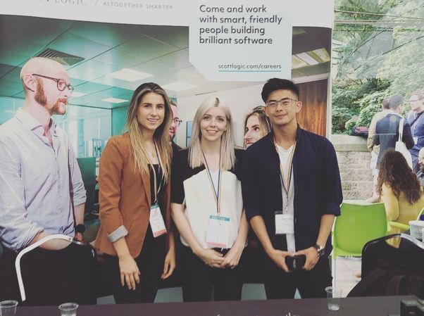
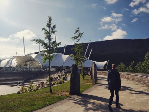
Last week I attended the annual UX Scotland conference held at the amazing Dynamic Earth here in the heart of Edinburgh. The three-day conference, sponsored by Scott Logic, consisted of some thought provoking and insightful talks, the most interesting of which centred around 3 main themes: the exploration of real-world experiences, how the industry is adapting to future technologies and the presence of creative and innovative thinkers in design.
Real World Experiences
Many of this year’s talks centred around sharing case studies of live projects, introducing the audience to real and tangible examples of UX problems the speakers had encountered in their work. This theme of sharing problems and the steps taken to solve them was greatly beneficial to both new and seasoned designers.
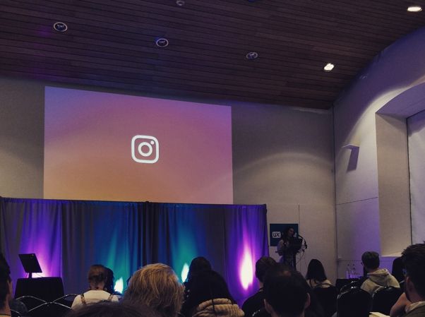
Whitney Trump gave us an insight into the growth of Instagram with her talk ‘Thoughtful growth: designing experiences for Instagram’s new and next users’. Using the analogy of going to a party Whitney detailed step by step the rules Instagram have followed to encourage growth within the company. The key points were advertising, onboarding, connecting with friends and maintaining a long-lasting relationship with your users.
Later on that day, Sarah Folkes and Selene Hinkley presented work they did to improve the search experience within Shopify in their talk ‘The search continues: creating a great search experience in a post-Google world’. The core elements of the talk were about having data informed search results and adding keywords. They highlighted that quick search is an important feature of any search experience. Introducing breadcrumbs onto Shopify helped educate their users where they were located in the product, which enabled them to search quicker the next time they visited the site. To prevent any lag, they placed results that took longer to load at the bottom of the search list so that users could get instant results from their search. Finally, they spoke about the importance of introducing error messages that include next steps for the user, in an effort to combat the user feeling confused and unsure of where to go when an error occurs.
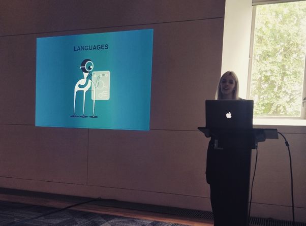
By far the biggest highlight at UX Scotland was getting to see our very own Scott Logic employee Courtney Yule, presenting her well-crafted talk on ‘Expecting the Unexpected: Designing for edge cases’. During the talk, she drew on some personal experience from a recent project that she undertook with Scott Logic. Courtney highlighted the importance of considering edge cases when designing an application, but also stressed that not every scenario can be prevented. She touched on some possible edge cases to consider when designing for a project, such as character limits, accessibility, empty states, responsive layouts and language requirements. In summary, her talk outlined that while edge cases are extremely important and need to be considered, you cannot and should not plan for every edge case.
Hearing these designers explore in detail the real world problems they encountered when designing was intriguing, it was great to see how they processed and solved any issues.
Adapting to Future Concepts and Technologies
Things are rapidly changing in the design world, and at UX Scotland another prevalent theme was how designers are adapting to future concepts and technologies.
Sarah Morgan from Fanduel in her talk ‘Bridging the 3000-mile gap between the users and you’ mainly focused on working remotely with a team in other countries and dealing with challenges that come about from that, such as the difference in culture and time zone. The talk really highlighted that working remotely isn’t just a futuristic idea anymore, it’s becoming extremely common in the technology industry. Sarah clearly portrayed how her team adapted to remote working. As long as you have the right tools, skills and mindset to undertake it, it can be executed as well as any on-site experience. At Scott Logic remote working is a very familiar concept to our employees. Many designers and developers work with teams around the world on a daily basis. I found this talk to be compelling, as I could relate to a great amount of struggles and issues that Sarah and her team at Fanduel overcame.
The final talk of the first day was presented by David Taylor and Heather Bayfield from E-VR. Their talk ‘Designing for VR: what we’ve learned’ centred around their new product ‘Loqui’ which is a VR language learning application, aimed at teaching kids a new language before they enter high school. They have tried to maximize VRs capabilities by allowing students to immerse themselves in the country of the language they are learning. The application aspires to teach students vocabulary through interactive conversations with virtual characters, within the game. I found this to be a very impressive and unique approach to teaching children a new language.
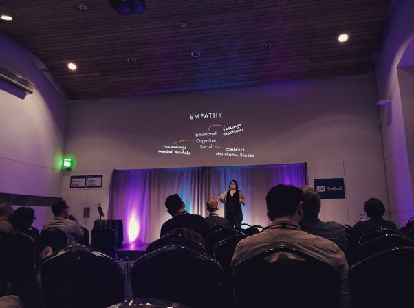
Finally, Heather O’Neill gave an eye-opening talk on ‘Overcoming Bias in Design’. Her talk discussed all the possible biases that come into play when designing a product. Companies are becoming more aware of issues such as diversity and equality in the workplace. Heather highlighted that this should also translate into the products and experiences that we are creating. One of the main pieces of advice that Heather gave was to make sure that you listen to people who aren’t like you. Only speaking with users and designers who are like minded will severely restrict the design process. We need to speak with a diverse group of people when designing an application, to ensure that we hear about all the issues a user may face, that we may not be affected by or aware of.
Creative and Innovative Thinkers
Another exciting aspect of the conference was getting to see both John Lloyd and Aaron Kovalcsik’s creative design processes demonstrated in two different but entertaining talks. John Lloyd from Hilton presented a very unique talk about ‘Practising Creativity’. John told the tale of how his work calendar became inundated with meetings and how he felt he was lacking creativity in his job. So, he set himself the challenge of creating one white board drawing a week for fifty-two weeks to inject some creativity back into his work life. My favourite drawing had to be the periodic table he drew explaining company acronyms, it was not only creative but very useful for his organisation. His motivation to be creative and draw weekly was inspiring.
Later on, we were given a captivating talk by Aaron Kovalcsik about ‘Using a Google Design Sprint as a product superpower’. He spoke about how implementing a design sprint impacted his team and their product at Indeed. One important takeaway from the talk was that sometimes it’s just not possible to follow the exact rules of a design sprint. The key to a successful sprint week is customising the guidelines to your organisation. Every company has different needs and circumstances to consider, so you shouldn’t be afraid to adjust some aspects to suit your requirements. One example being that it wasn’t possible for every employee to be physically present at the sprint, because of this they allowed people to remotely dial in. Seeing Aaron and his team taking the initiative to inject a new idea and process into their workflow was something I’ll definitely take back with me to Scott Logic.
Overall, it was a very successful few days at UX Scotland. I saw some exceptional talks and felt extremely inspired after listening to all these creative professionals speak. Thank you UX Scotland!


