Sketching is a process we are all familiar with. It is especially beneficial for UX designers, as it’s a quick and inexpensive way to create a quick solution to difficult problems. There are many directions a design can take when generating ideas for a project. But sketching can get the ball rolling and help you look beyond perfection.
It’s easy to get caught up in the little things and making a design pixel perfect. Sketching out all your ideas can help prevent getting consumed by the visuals, and force you to focus on the experience you’re creating.
You can quickly explore multiple routes of a concept, without investing hours making high fidelity wireframes. The beginning stages of a project can be intimating which is what makes sketching so great. It helps create an idea that you can continually iterate with minimal cost.
Tools you need
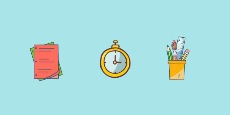
Let’s get started! All you’ll need is a timer, sharpie, fine pen, pencil, eraser and paper. The sharpie can be used for structural aspects of the sketch like the border to frame your designs. The pencil should be used for shading and drop shadows. While a fine pen is needed for smaller details such as text or images drawn.
Choosing an idea
Personally, I find this can be one of the most difficult aspects of sketching. When you first start on a project there are so many ideas and concepts running through your head, that it can be hard to choose a place to start. So just sit down, and actually think about your project. What are the key interactions you need to create? Choose the most interesting aspect that frames the project and expand on that one idea from there.
Let the sketching begin
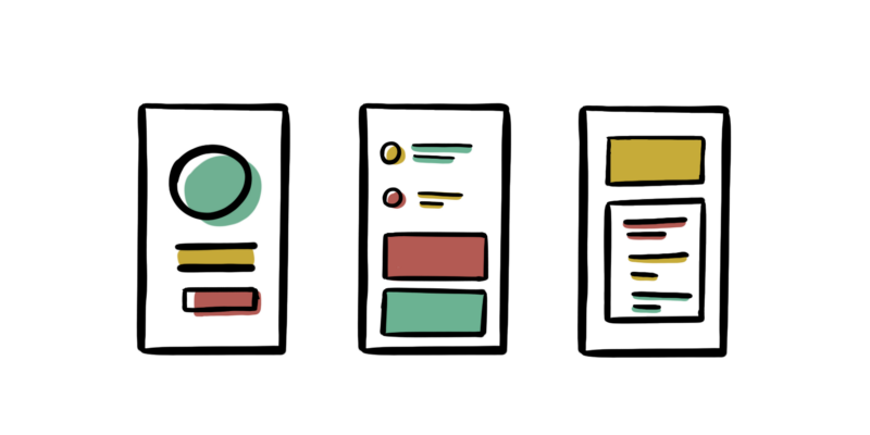
To begin, grab a piece of paper and divide the page into four sections. You’re going to generate four unique mock ups relating to your chosen interaction. Try to make each one different from the last. Now grab your phone and set a timer for four minutes. Roughly spend one minute on each idea. Even though you may be tempted, don’t go over the allocated time, this is an important step.
You may wonder how having less time to design could work, but you’ll be surprised at your brains reaction to stress. When you’re put under pressure to create quick mock ups you’ll discover that’s when you generate your best ideas. I have found that my finest work has been a product of practising this method.
Avoid getting caught up with perfection
I’m definitely a person that can get caught up in the fine details, I get hooked on one idea and pursue it in depth. However, this doesn’t always produce the best results. Homing in on one idea and going in depth at such an early stage can be disastrous. You end up getting stuck on one train of thought, that ultimately may not be the best solution.
The pressure intensifies when you involve other designers in this activity. If you have the opportunity, grab a few designers in the office and have a sketching session. Bouncing your concepts off others is the best way to generate more ideas, plus you’ll more than likely be inspired by components the other designers have made. Everyone processes designs differently, so getting another perspective is incredibly valuable.
Expanding your initial sketches
Now that you’ve sketched your ideas, pick your favourite concept and expand on the idea. It’s likely that you’ll merge aspects from your other sketches into this mock up and that’s exactly the point of this process. Spend some time polishing your sketches and get the flow clear in your head.
Getting feedback on your designs
Now it’s time to meet with your colleagues to review your designs. Begin by explaining the project then take them through the flow of your sketches. Encourage any questions and take notes of all the feedback given to you throughout the meeting.

It can be easy to confuse feedback with criticism, an attack on your designs may feel like a personal insult to you, but it is vital to take every word on board and actually consider the advice you’re given. Your colleagues feedback will be far more constructive than an end user, so iron out any flaws early in the process. Write down any advice that they give and make clear notes beside the relevant sketches so you’ll be able to recall and process the feedback once the meeting has commenced. Also, take note of people’s reactions, what is it that they liked about your sketches? Dig a little deeper and try to get them to expand on what makes them enjoy it so much.
After you have presented your sketches and the meeting has finished, iterate your mock ups while the feedback is still fresh in your head. The goal at the end of the day is to have a clear design that you’re ready to recreate digitally.
Suck at sketching
Just because you are a UX designer doesn’t mean you are a professional artist. Digital creativity doesn’t always transfer on paper. But don’t worry, sketching could still be for you.
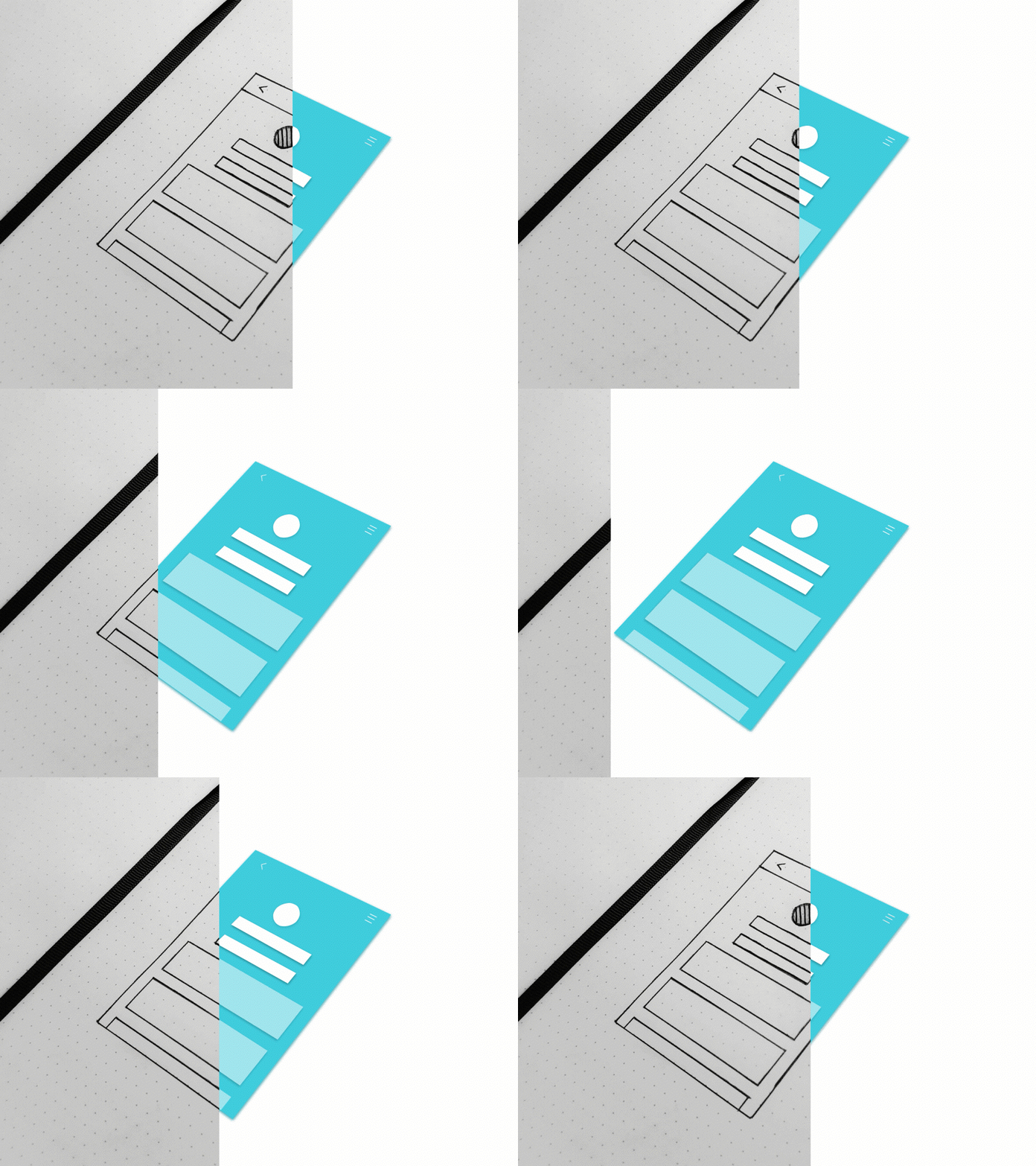
When I first started sketching I felt more comfortable drawing a rough outline of the screen, with lengthy annotations surrounding the mock up, narrating the vision in my mind. I still enjoyed transferring my ideas on paper, meaning my shaky lines and blurry sketches didn’t hold me back. Over time, I eased myself into adding more sketching details and now I much rather the process of actually sketching than narrating my ideas.
Don’t forget there are a wide variety of resources out there to help create digital wireframes, one example being Balsamiq. If you would rather more polished sketches then this could be the solution for you.
I regret ever letting my artistic skills hold me back, that’s not what the sketching process is about. It’s about designing quickly, generating ideas and being as creative as possible in the initial stage of your project, without investing too much time on the wrong idea. Don’t ever let perfection hold you back. Now go start sketching!


