
Introduction
Styling in Android can be a mystifying experience for developers not familiar with how the framework works. However, once you start to understand the “Android way” the development experience can be both logical and enjoyable (excepting a few quirks, but for the Android developer - c’est la vie).
CSS is perhaps the most widely understood equivalent so to aid understanding there are some comparisons throughout this article between Android styling and CSS. The first noticeable difference between web tech and Android is the syntax of the styling language. Arguably an advantage of Android over the web is that it uses XML for both layout and styling which minimises the amount of time developers need to spend learning it. The web mixes HTML and CSS which, although now very widely known, could be slightly more difficult for a new developer to learn, and thus more costly for a tech company training new hires. On the other hand, in my experience Android development is generally more difficult than web development so this potential gain in efficiency is largely outweighed by other areas where the web is superior.
Units
Android developers can define layouts in terms of pixels (px), density-independent pixels (dp, or dip) or scale-independent pixels (sp). Usage of pixels is highly discouraged due to the variance across Android devices in screen density and font size. Therefore, dp is the de-facto unit of measure for layouts and dimensions; 1dp should physically be the same width on every Android device, regardless of screen pixel density. Accessibility options allow the user to change the effective screen density and the font size, the former resulting in an increase in the size of elements defined in dp but not in px. Thus, dp is a more accessible unit to use. Font size can be increased independently of screen density, so fonts must be defined in another unit, sp, which will scale with both the screen density and font size.
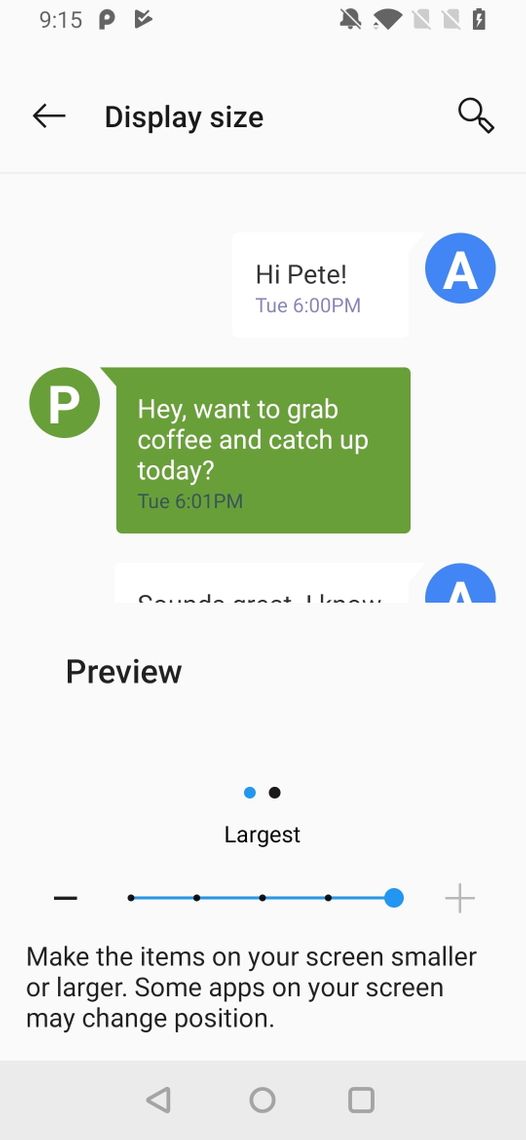
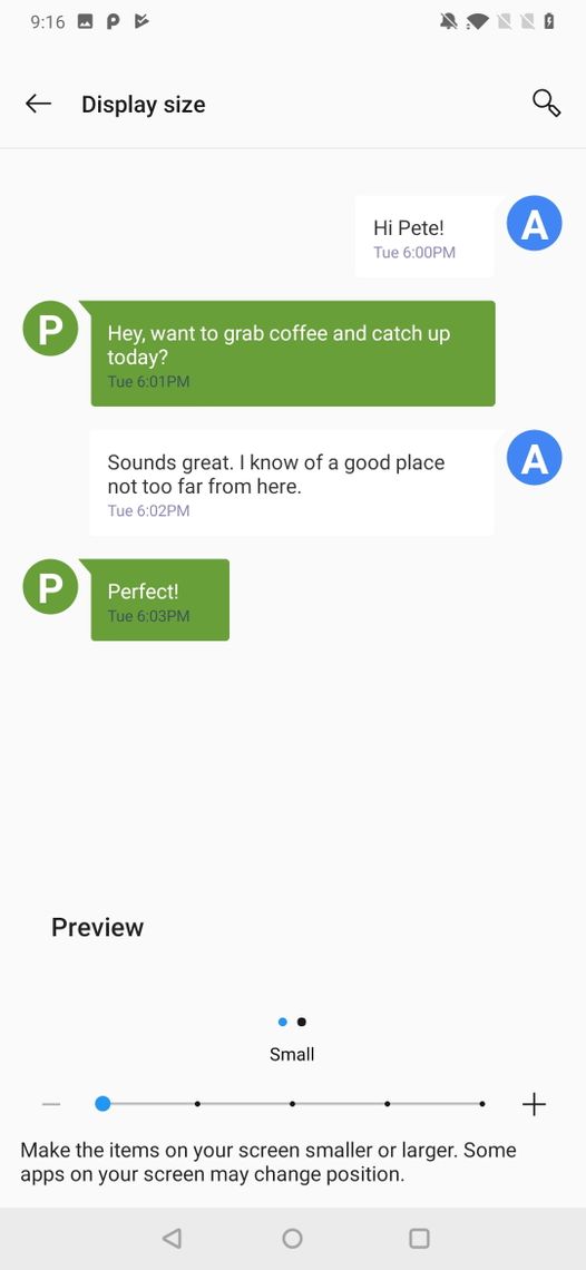
The user can change the display size through the settings app. Here are two screenshots from the OnePlus 6T which show the difference between the largest and smallest display settings. On each the elements have the same sizes in dp but this corresponds to different numbers of px when the display size is changed. It’s important for UX designers to take this into account when wireframing responsive layouts.
Media Queries vs Resource Qualifiers
Media queries are a useful tool in CSS to enable different styles to be applied to an application depending on the window size. Resource qualifiers are similar in Android but far more powerful. Whereas on the web the media queries for each screen size are defined within the same stylesheet, the design of resource qualifiers means that each screen size has a different XML file. There are directories for each type of resource, for example layout and drawable. If a qualifier is used, a directory for that specific qualifier is created, for example layout-w240dp would contain all layout resources for screen widths smaller than 240dp. Android qualifiers are versatile; they can select from a wide range of device and user attributes, from language and country to whether night mode is enabled, to Android version and screen orientation.
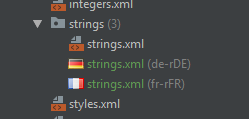
Google recommends that all strings used in an app should be defined in a separate strings.xml file, then referenced within the layout files or code. This is to enable region and language specific resources. For example, if a UK English speaking user downloads the app the Play Store will provide them with the resources specific to this region. However, if a French speaking Canadian user downloads the app then the Play Store will select the French-Canadian strings and provide the user with those instead. This flexible system allows not only a change in language but also a change in layout or functionality across countries where appropriate.
In this example, there are French-France and German-Germany locale-specific string files, and if the device is outside these regions then the default (English) will be used.
Architecture
Architecture is important due to the constant need for developers to change and adapt existing systems to match ever shifting requirements. Ideally we would have full knowledge of a project. However, certain pragmatic steps should be taken to insure against uncertainty.
Take colours for example. A developer can feasibly enter the hex code for a colour every time is used within a component. However, suppose that the client wanted to change the colour “pale-green” to “bright-green”. In this case, the developer would have to do a find and replace on every occurrence of the hex code for “pale-green”. A better approach is to define a variable “pale-green” in one place, then use that reference everywhere. Android has the color tags to support this.
<color name="green">#45F442</color>
However, there is still a problem with this. Suppose the app has blue text within both text input boxes (EditTexts) and also labels (TextViews), and both components achieve this by referencing the “blue” colour. If the client wishes to change the colour of the labels, but not the input boxes, to “dark-red” then this will be a tedious change to make. However, if the developer had created two styles, one for the TextView and one for the EditText which both in turn reference the colour they need, then this change would be trivial.
<style name="TextStyle.AppTheme.EditText" parent="TextStyle.AtomTheme.Input" >
    <item name="android:textColor">@color/blue</item>
</style>
<style name="TextStyle.AppTheme.TextView" parent="TextStyle.AtomTheme.Input" >
    <item name="android:textColor">@color/darkRed</item>
</style>
There are now two levels of abstraction from hex codes within the styles of the app; the colours and styles. Depending on how changeable you desire the app to be, you could add another layer of abstraction on top of this; theming. A theme allows you to dynamically select between styles. This can be achieved by defining theme-level colours, such as “colorPrimary”, which are used within the styles instead of colours directly, such as “pale-green” or “red”. Each theme-level colour would reference a defined colour, such as “pale-green”, and this mapping of theme-colours to actual colours could be different for different themes, enabling different themes with different colour schemes.
<style name="AppTheme" parent="Theme.MaterialComponents.Light.DarkActionBar">
    <item name="colorPrimary">@color/blue</item>
    <item name="colorPrimaryDark">@color/black</item>
    <item name="colorAccent">@color/red</item>
    <item name="colorOnPrimary">@color/white</item>
</style>
As you can see, it is easy to keep on abstracting with more and more degrees of separation between your hex code and the colour or style you actually use in the app. To a certain point more levels of abstraction can be helpful for allowing separation of components, however the increased complexity can sometimes be hard to manage. Thus, the optimal number of layers of abstraction is a trade-off between simplicity (few) and flexibility (many).
Naming
The name of a base style should be written in PascalCase, and each subsequent child style should be appended to this name with a dot separator.
For example,
<style name="TextAppearance.LightTheme.InputField.Small" />
Inherits from
<style name="TextAppearance.LightTheme.InputField" />
Which inherits from
<style name="TextAppearance.LightTheme" />
Which inherits from
<style name="TextAppearance" />
Styles can easily override this default ability and inherit from other styles by specifying a “parent” attribute.
For example,
<style name="TextAppearance.LightTheme.InputField.Small" parent="Body.SmallText" />
Bugs
There are a number of bugs with the Android style framework which spoil the architecture outlined above; these require pragmatic workarounds. For example, the EditText component has a textAppearance attribute, which is designed to style the text within the input field. However, this attribute ignores any font styles or weights that are specified within the TextAppearance style used. A workaround for this issue is to specify the style attribute on the EditText as a TextStyle, which is exactly the same as the TextAppearance except that it includes font styles and weights.
Conclusion
Thank you for reading this article and I hope you have been given a good overview of this framework that can serve as an introduction to styling in Android. While there are many frustrations that developers have with the styling framework, Android has been rapidly improving over the past few years and it shows no signs of slowing down. It may not be as mature or as easy to develop for as the web but the importance of Android cannot be understated in today’s marketplace.
More Information
There are loads of excellent articles and guides written on Android styling, from UX design to implementation. The best place to start is the Android Guide on Theming.
