Junior developers who were recently introduced to CSS might be overwhelmed by the sheer number of various length-measuring units available. Someone might say not to use px as absolute units don’t change in responsive design but is that really the case?
Let’s have a quick overview on the various units and when they can be useful.
The Absolute Units
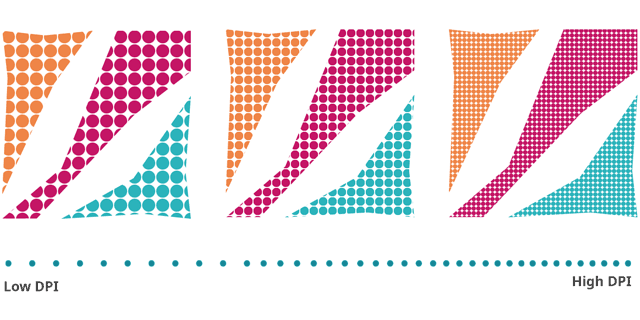
px - a pixel is the smallest point that the screen can present. Although with the introduction of retina displays that have a high pixel density, modern day px represents a virtual pixel rather than the monitor’s actual capabilities. This is big news because it means px is no longer absolute. Let’s get back to that later.

cm, mm, q, in, pc, pt - centimetres, millimetres, quarter-millimeter , inches, picas (1/6 of an inch), and points (1/72 of an inch) are recommended for printing, and not for the screen. The first computer-printer could print dots as small as 1/72 per inch, hence 1pt equals 1 dot for a low-resolution printer. Nowadays, printers can reach 150, 300, 600 or even 1200 points per inch so that’s an indication how small that point can be. Therefore it’s probably smart to use one of the other measuring using or a relative unit to make sure the page is printed as we expect it, regardless of the printer’s resolution.

The Relative Units
% - percentage is relatively easy to understand – it’s relative to the parent. The only issue is – what is considered the parent? It might be an obvious answer unless the item’s position is absolute and then things become slightly trickier.
<img src=”/osharon/assets/css-length-units/positioning.gif” “absolute-positioning items can be tricky when using percentage”/>
em - referring to the proportions of the parent’s font-size (specifically referring to the width of the “m” character). 2emwould be double the current size. It makes sense but if we build css-contained components, their size will be proportionate to their parent-container.
rem - like em but the proportions are in reference to the root font-size (of the html tag) instead of the parent, so our component will stay the same size regardless of their parents.
By default, the browser default font-size is 16px but if we set the following rules, our base font-size will be the equivalent of 10px so 1rem=10px, which make it easy to calculate -
css
html { font-size: 62.5%; }
body { font-size: 1.6rem; }
Why not simply use px instead? Because we said that 16px is the default size and the user might decide to change it in the user-settings for accessibility reasons. If our layout is based on px it would ignore the user setting and provide a sub-optimal experience with a broken layout or a layout too small for the user to read.
[s,l,d]v[h,w,i,b,min,max]- 24 different viewport-based measure units refering to visible area of the web page on the user’s device.
*vh is the height and *vw is the width of the viewport.
*vmin and *vmax are the smaller and bigger values of the viewport’s dimensions, respectively
*vi(inline) and *vb (block) refers to width or height, depending on the direction of the text. In horizontal languages (like English) vi equals vh and vb equals vw but it can be easily flipped if we change the language to a vertical language such as Japanese.
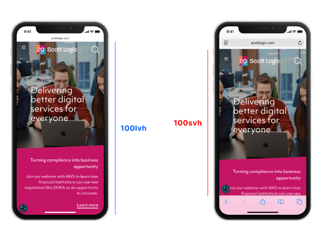
sv*(small) is the viewport size on a device when the browser controls are visible while
lv* (large) is when the controls are hidden. It’s important to remember that sv* and lv* are fixed numbers regardless whether the controls are visible or not. dv*(dynamic) is the current viewport, either small or large. This matters when trying to build a layout that snugly fits to the viewport full height, but it changes as soon as the control disappears (because the user started scrolling for example). If not specified s|l|d, the original v* equals to lv* (large).

The Weird Units (that aren’t necessarily supported anyhow)
There’s a set of units that are a bit more niche
ch - width of the “0” character
ex - height of the “x” character
cap - height of the capital characters (this is useful for setting an icon next to the text, for example)
ic - width of CJK water ideograph (水)
lh - line height of the parent element
rlh – line height of the root element
Takeaways
If you still feel overwhelmed, my advice is considering only three options:
For printing, you can use accurate sizes (mm) that will match your design.
For a web pages, use rem and the page will resize as it should. You might want to consider setting 1rem=10px for ease of use but that’s absolutely optional.
For a web-application, you might want to refer to the viewport and fill it. If you ever comes across a scenario where these options aren’t good enough, know that other options exists and you’re one of the few who actually used them sensibly.


