
I recently downloaded run data for the 7,190 athletes who recorded their London Marathon on Strava, a popular platform for runners and cyclists. This blog post visualises and analyses the data in various interesting ways!
Introduction
I’ve been an enthusiastic (addicted?) runner for about five years now, and if there’s one thing us runners like its data. My next race is Edinburgh Marathon in May, and as a result I am spending far too much time looking at training plans, reading about the 80-20 rule, negative splits, nutrition, pace zones - and just as importantly, finding out what every other runner is up to!
I’ve been a member of Strava for a few years and really enjoy the interesting things they do with their vast quantities of data in their labs, and as a developer, of course I’ve explored their API. While looking at a marathon training plan, it made me wonder, “do people actually follow a plan? and if so, what is it?” - which gave me the idea of downloading the training data for all the athletes who logged their London Marathon on Strava in order to answer this question.
I’ve been grabbing the data and persisting it in a Mongo database, using a combination of D3 and d3fc to analyse and visualise it. So far I’ve obtained the mile splits data for the 7,190 Strava athletes who ran this race - and found some really interesting patterns in the data without having to delve into their training history (I’ll return to that in a later post).
Pace Distribution
One of the first things I did is to render the pace distribution of all the athletes on a single chart to provide a quick verification that my data was correct (I’d had to do a few tweaks and corrections, converting km splits into mile splits). My intention was to summarise the splits data, however, I found it to be quite beautiful and rich in its most raw form.
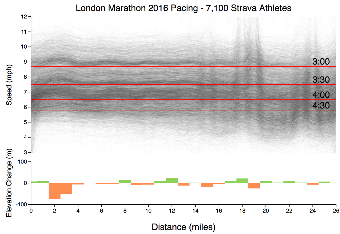
Here’s the chart, with all 7,190 lines rendered at a low opacity so that they blend together. The horizontal lines show the speed you would have to run to achieve certain finish times.
(view the code for this chart)
Here are some of the patterns that I’ve spotted in this chart:
- You can see that the lines are clustered into dark bands, one that starts just above the 3 hour line, one just above 3:30, and a less well-defined band above 4:00. These clusters are due to runners who are aiming to complete the marathon at popular target times - 3 hours, 3:30, 4 hours. In each case the athletes are starting at a pace that is just a touch faster than required.
- The faster athletes immediately set out at a decent pace, whereas the slower athletes, e.g. those starting around 6mph, take a little while to get up to speed. This is almost certainly due to congestion at the start of this popular event.
- You can see a ‘bump’ in the pace for the first couple of miles, due to there being a couple of downhill miles at the start of the event. After this, everyone appears to settle into a steady pace for a good ten miles.
- Something funny goes on around mile 18-19, with many athletes making a change in pace, some faster, some slower. This could be due to elevation changes, which although minor, have a bigger impact on fatigued runners. Or, perhaps it is due to GPS inaccuracies? This part of the course takes runners through Canary Wharf, which has many high buildings.
- Towards the final mile you can see that most athletes accelerate.
It’s really interesting the patterns you can see by rendering all the data, rather than summarising it.
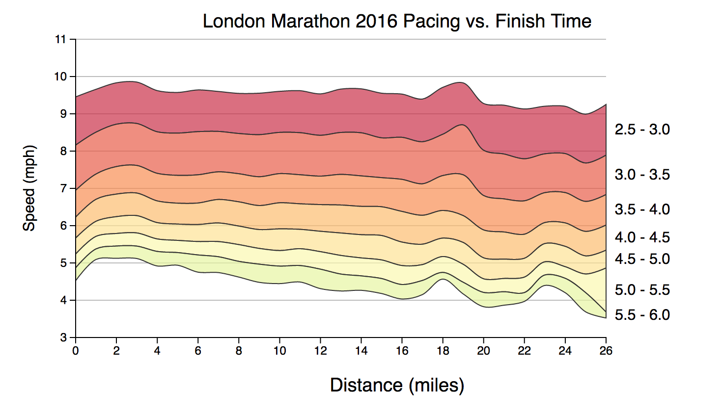
The following chart shows the same data, but with the pace data averaged into bands based on finish time:
(view the code for this chart)
The overall shape of the data is clearer, with faster runners being generally more consistent and holding their pace, whereas the slower runners decline in speed throughout the race.
Finish Time distribution
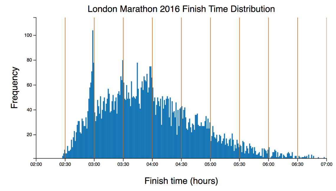
In the first chart I noted the clustering of pace just above certain target finish times. So just what time did these athlete finish in?
The following chart shows the distribution of finish times for all the athletes:
(view the code for this chart)
You can see a very prominent clustering of times, just under 3 hours, 3:30 and 4 hours, again, highlighting the popular target finish times. You can also see smaller clusters around 2:45 and 3:15. It’s pleasing to see so many people successfully achieving their sub-3 hour goal (that’ll be me one day … I hope!)
At this point it’s probably worth noting that that this sample is rather biased. Faster, and more serious (addicted!) runners are far more likely to be registered on Strava and recording runs, which is why this chart shows some really impressive performances.
Show me the code
This post is about data and patterns, rather than the code I used to find them. However, if you are interested in the details, these charts make use of D3 and d3fc, which extends the vocabulary of D3 (SVG, paths, lines, etc…) to encompass charting concepts such as series, charts, annotations, while still adhering to the D3 patterns of selections and data-joins.
The use of d3fc made it quite a bit easier to render these charts than if I’d just used D3. If you want to dig into the details, each chart has a link to its source code.
Back to the data …
Negative Splits
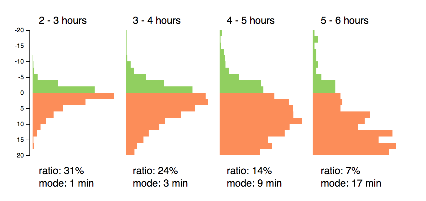
A well-known race tactic is that of running negative splits, where you run the first half of the race slightly slower than the second. Despite sounding quite simple, it is notoriously difficult to achieve.
The following small-multiples chart shows the split distribution for runners that finished within hour intervals:
(view the code for this chart)
You can see that those runners that finished between 2-3 hours, 31% managed to run a negative split, with the most common split being just 1 minute. The fastest runners in a marathon are very experienced and consistent. With each successive finishing band you can see that the negative split ratio rapidly drops, as does the mode (or most common) split time. Running a good marathon is something that takes practice and discipline, it’s not easy!
Conclusions
I hope you’ve enjoyed this exploration of marathon data. If you spot any other patterns in this data, or have an idea for further analysis, please let me know.
I’ll get back to analysing the training data for these athletes in the time leading up to the marathon.
… or perhaps I’ll pop out for a run.
Regards, Colin E.