What is Perspective?
Perspective is an open source streaming analytics engine from JP Morgan. It uses WebAssembly to quickly analyse a dataset and create views for displaying in a chart or grid. Perspective also has a UI which you can use to pivot and filter the data, and uses a plugin framework to view the results in grid or chart form. This is where d3fc comes in.
Perspective already has a Highcharts plugin for the chart views. It looks pretty good, but Highcharts requires a paid license, so isn’t suitable for everyone. The d3fc library seemed like a perfect fit as an open source replacement for Highcharts.
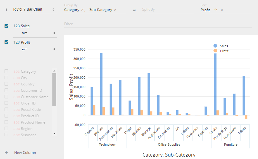
Here’s an example of the d3fc plugin in action:
Or click here for a live example you can interact with: d3fc Example
d3fc as a generic charting view
If you have a look at the d3fc code examples, you’ll find that each one is designed for a specific chart view. They have data that is structured for the intended view, along with axes, series and other features that are customised for that view. None of that really lends itself to a generic chart component that can display a wide variety of charts.
We want to follow the style of D3 and d3fc components, and build up a set of tools that can be reused across the various chart types.
The entry point for rendering a chart will just be a simple function, where settings contains the data, and also all the configuration information (what the row and column splits are, and field types etc).
function columnChart(container, settings) {
  // Re-arrange settings.data from a table into something suitable for this chart
  const data = ?;

  // Setup the series for this chart type
  const series = ?;

  // Figure out what axis types, scales and settings we need for this data and chart
  const xAxis = ?;
  const yAxis = ?;

  // Put it together in a chart with the appropriate settings
  const chart = fc.chartSvgCartesian(xAxis.scale, yAxis.scale)
  	.plotArea(series)
  	.?;

  // Render the chart to the container with data
  container.datum(data).call(chart);
}
Data and Series
Each chart type will need its own representation of the data to match the type of series we want to use. For the column chart in the image above, we need multiple seriesSvgBar (one for “Sales” and one for “Profit”), combined with seriesSvgMulti. If you pick something in the “Split By” option, then we also want to stack bars on top of each other, so to do that we need seriesSvgGrouped.
Other chart types will need to re-use a lot of this code. The horizontal bar chart is identical to the column chart, whereas the line and area charts are very similar, but without the stacking.
// Group the data into multiple series of stacked data
const data = groupData(settings.data, { stack: true });

// Create the multiple grouped-bar series
const barSeries = fc.seriesSvgGrouped(fc.seriesSvgBar()).orient("vertical");
const series = fc.seriesSvgMulti()
    .mapping((data, index) => data[index])
    .series(data.map(() => barSeries);
I’ll leave the details of the data function to your imagination (or else you could go and look at the source). Essentially it’s taking a simple table of data and re-writing it into an array for each series.
Axis factory
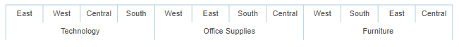
In the above example, we have an ordinal horizontal axis (categories) and a linear vertical axis (numeric). However, if instead of picking “abc” (string) values for the “Group By” setting, you choose a date value, the chart will display a linear horizontal axis (datetime).
A lot of other chart types will have similar requirements for axis types, so we want to move this logic into a reusable component. Some of those charts can also support displaying an ordinal Y axis, but for the column chart it doesn’t make any sense to draw a column between two ordinal values.
Our X/Y Scatter chart actually prefers linear axes for both X and Y (though does actually support an ordinal axis in both directions too). The Heatmap chart is the opposite as it’s designed primarily for ordinal axes, but can also display linear.
// Use the axisFactory to get the correct scales and settings for a column chart
const xAxis = axisFactory(settings)
    .excludeType(AXIS_TYPES.linear)
    .settingName("crossValues")(data);
const yAxis = axisFactory(settings)
    .orient("vertical")
    .excludeType(AXIS_TYPES.ordinal)
    .settingName("mainValues")(data);

// Delegate to a chartFactory to construct a chart object from the axis information
const chart = chartSvgFactory(xAxis, yAxis).plotArea(series);
In the abbreviated example above, “crossValues” and “mainValues” identify the values in the source data that the axis will be based on, so the axisFactory will check what type those values are (ordinal / datetime / linear). Internally it composes factories for each of those three types that can deliver the correct scale, domain and other settings.
The value returned from axisFactory is actually an object that contains the scale and domain, along with a label function, sizing information, and sometimes a custom component to change how the axis is rendered (more on that later). Putting together the two sets of axis objects into a chart is going to be similar across all chart types, so we move that into a factory component too.
Special features
As part of this project, we’ve made a few contributions back to d3fc. I hope to have a follow-up post soon that will go into those enhancements in a bit more detail. One of them, which can be seen in the above example, allows us to provide the cartesian chart with a custom axis component.
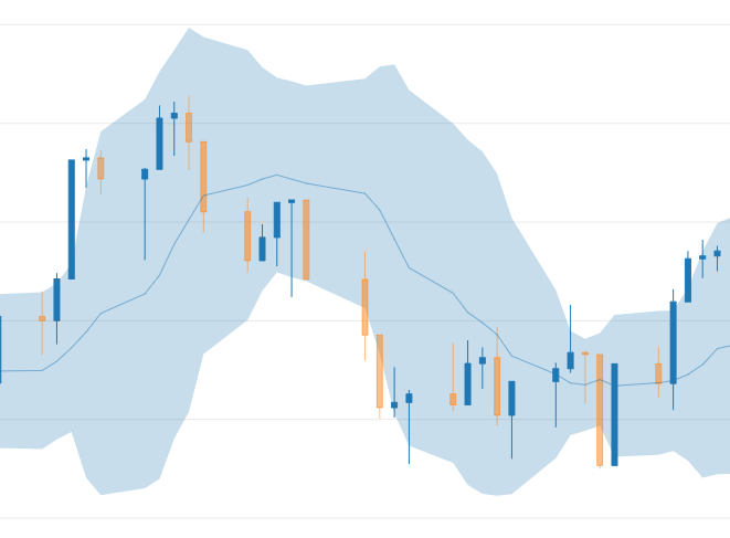
We’ve implemented a custom axis component that can split the axis labels into groups, and automatically rotate and hide labels when there is not enough room to display them all horizontally. I hope to write a follow-up on this as well, with a working example of a custom axis that can easily be reused on other projects. Here’s another example:
Wrap up
Our initial objectives with this project were simply to offer like-for-like replacements for the Highcharts views that d3fc supports. Later, that expanded to include other non-cartesian chart types that required a bit more D3 magic (“sunburst” and “treemap”). We’re now getting close to a complete, open source replacement for the Highcharts plugin.
For bonus points, we’ve even added an extra chart type especially for financial data, showing an OHLC/Candlestick view with bollinger bands and moving average.
The Perspective d3fc plugin is now a core plugin in Perspective. You can see the package here: d3fc Plugin Project
Colin has previously explored building custom d3fc visualisations on realtime data with Perspective. You can read that here: Realtime crypto charting with JPM Perspective and d3fc.