The mobile operating systems iOS (Apple) and Android (Google) make up over 97% of the global mobile market share. Although iOS dominates the profit share, due to the high activity levels of its users, Android dominates the overall market share, with just over 74% of the global total.
Therefore, in order to reach as many users as possible, consumer app developers need to consider designing for both iOS and Android platforms. When it comes to the implementation of a cross-platform design strategy there tends to be a scale on which a company can position itself.
At one end, there is the goal of ‘Platform Parity’ where the aim is to maintain the exact same features and visual language/feel across both their iOS and Android apps. This may involve creating custom components so that they can maintain this consistency. At the other end of the scale is the goal of ‘Platform specific design’. The features, flows and components in products adhering to this approach would mirror the technology available in each platform. This usually focuses more heavily on the use of iOS Human Interface Guidelines and Google Material Design native components.
Understanding the pros and cons of the goals at each end of the scale, and deciding where your cross-platform strategy should sit is paramount to producing an effective application and maintaining a successful product life cycle.
Platform Parity
With platform parity, the aim is to create as consistent an experience as possible between the iOS and Android apps. There are varying degrees to which this can be executed. One way to do this would be to include the same features and functions, but make the components themselves native to the individual platforms. The other end of the spectrum would be to create custom components for every screen and feature (Not adhering to either set of guidelines) so that both apps look and behave exactly the same way. There are a few points to remember here:
Custom components are high cost and high risk - They often require significant development effort, additional testing and can more easily lead to failure, whether it be from a user experience perspective or due to a technical fault (in comparison to the native iOS and Android components).
There are some technical constraints relative to each platform - The implementation of a particular feature may be simple and quick on one platform, but difficult, time-consuming or even unsupported on another.
Consistency is a key principle of UX Design - In order to design intuitive interfaces consideration must be made to what patterns and components users are already familiar with. Maintaining consistency allows users to more easily transfer and apply knowledge to new contexts. In this case, the consistency between the two apps is arguably less important than the consistency the app has with all of the other apps on the same platform, since research shows people usually stick with the same OS for long periods of time.
With platform parity there is often a skew towards iOS being designated as the ‘main’ app or the main design language. This means that the design boundaries in Android are often heavily influenced by iOS. There are many reasons why this might be the case:
Profit - iOS users generally generate more profit. They are more active users, generating the most downloads and purchasing the most add-ons. As a demographic, iOS users tend to generate more personal wealth, so for banking applications in particular, this could be seen as a significant reason for directing design and development efforts towards a more native iOS app.
Design - Apple has long been considered the epitome of good design due to many factors including their historic commitment to user experience and clear, aesthetically pleasing visual language. Software design tools such as Sketch, InVision Studio, and Adobe XD have arguably better support for crafting iOS device specific designs over Android, creating a preference for designers to work with the iOS components and visual style in mind, with Android as an afterthought.
Platform Specific Design
Platform specific design is often thought of as the ‘best practice’ approach, particularly for development. Reducing the amount of custom components will increase app stability and reduce development time, plus, users should be more familiar with native platform patterns and controls. However, in contrast, total adherence to native guidelines can be quite restrictive for some companies, who want to create unique and innovative experiences and design languages for their products.
Google makes the following point in their article “Design from iOS to Android (and Back Again)”:
“It’s important to understand the idioms and behaviours of each platform before you start design and development. That way your users will be able to use and easily understand your app on the platform that is native to them, and you will have the most clear and true version of your product — no matter where it’s used.”
The main takeaway here is that when aiming for platform specific design, it is important to understand the actual platform itself, so that the rationale behind any design decisions can be understood. Was it driven by user experience concerns, or is it simply following the native guidelines? With this understanding in place, companies should be able to more easily and efficiently identify the areas in which they can and should use native vs custom components to get this balance right.
The final point on platform specific design relates to the different technology available on each. One small example is that on the Android Monzo app, users can use the ‘App Shortcuts’ to go directly to the ‘summary’ or ‘support’ pages, which is a relatively easy feature to implement on the Android app due to the way it is built. The same feature could be added to the iOS app, but this would require a lot of development effort. Should we make it our priority to try and keep the exact same features on both apps, or should we use our design and development effort to utilise the technology and features that are available to us per platform?
Current Challenger Bank Mobile Apps
Let’s take a look at how three of the major UK challenger banks; Monzo, Starling and Revolut deal with cross-platform design. They all have a ‘mobile-only’ business model, so their mobile applications are paramount to their success.
*The feature parity between some apps may be due to release cycles not being in sync, rather than due to specific design decisions. The Starling Bank Android app screens have been recreated as the app does not allow screen-grabs, presumably for privacy reasons.
Monzo
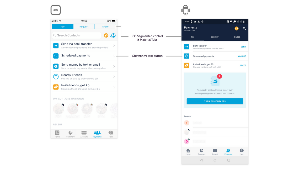
In general, Monzo’s approach to cross-platform design appears to be based on creating a similar look and feel across both their iOS and Android apps, while still making good use of native components. This gives the apps a platform familiarity, but also should increase the efficiency of their development cycles.
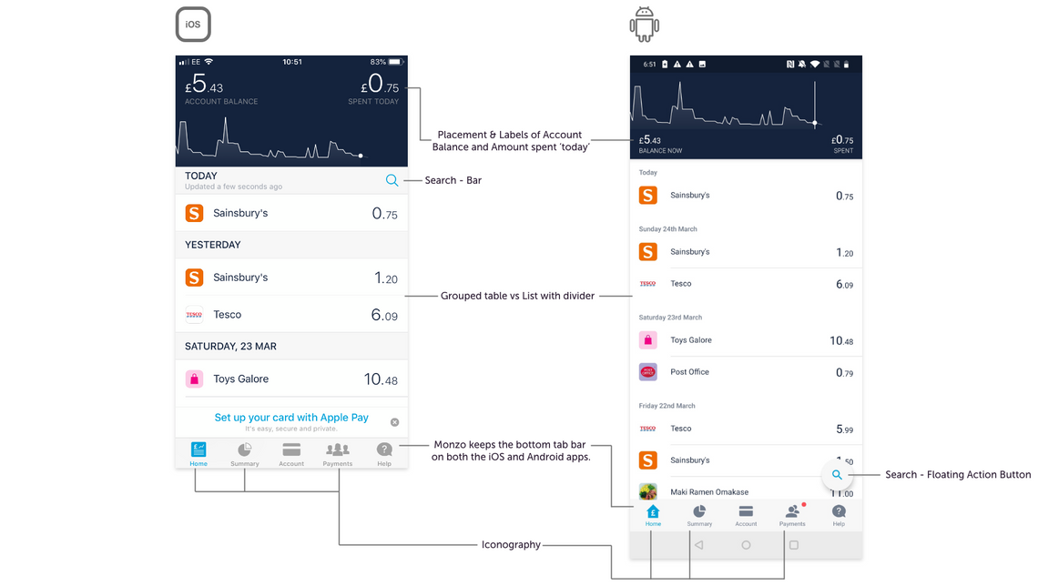
The search features shown above are framed within their native components; a search bar for iOS and a floating action button on Android. An additional piece of context here is that the searches actually work slightly differently. The iOS app has advanced searching, where the user can filter by certain parameters such as date, or payee etc. The Android search feature is basic in comparison, just using free text with no additional filters. Monzo has a valuable ‘community’ to utilise in terms of helping them find out which features users care about the most. This thread documents some of the feature disparities between the platforms.
Native iOS and Android navigation can often be one of the more difficult components to work with from a cross-platform perspective. This is made more challenging by the fact that Android comes with a global navigation bar, which can sometimes override the applications’ designed navigation patterns. If this is not the desired effect, this could cause issues, particularly in a registration flow, for example. Therefore, attention must be paid to this, and the flows for each platform should be considered with this in mind.
Monzo has opted to use bottom tab bars on both platforms. This is a standard navigation pattern for iOS, and although Android do have native bottom navigation bars, when used in conjunction with tabs (as Monzo has done, below), they may cause confusion if not used with caution. This is an example of Monzo understanding the behaviours and limitations of that platforms, and making a design decision from these constraints.
There are some small discrepancies with the microcopy across the two platforms, with slightly different wording or text sizes used. This could be for a number of reasons either intentional or accidental e.g. release schedules not being in sync so the microcopy hasn’t been updated, or just basic human error because there are two separate teams working on each platform which makes maintaining perfect consistency more difficult.
Starling Bank
Starling Bank differs slightly from the approach of Monzo by creating more custom components across their iOS and Android applications. This way they can have more control over their visual language and user experience. This likely comes at the cost of an increase in development effort for some components. They will need to make sure they are paying close attention to the user experience of any new components they introduce.
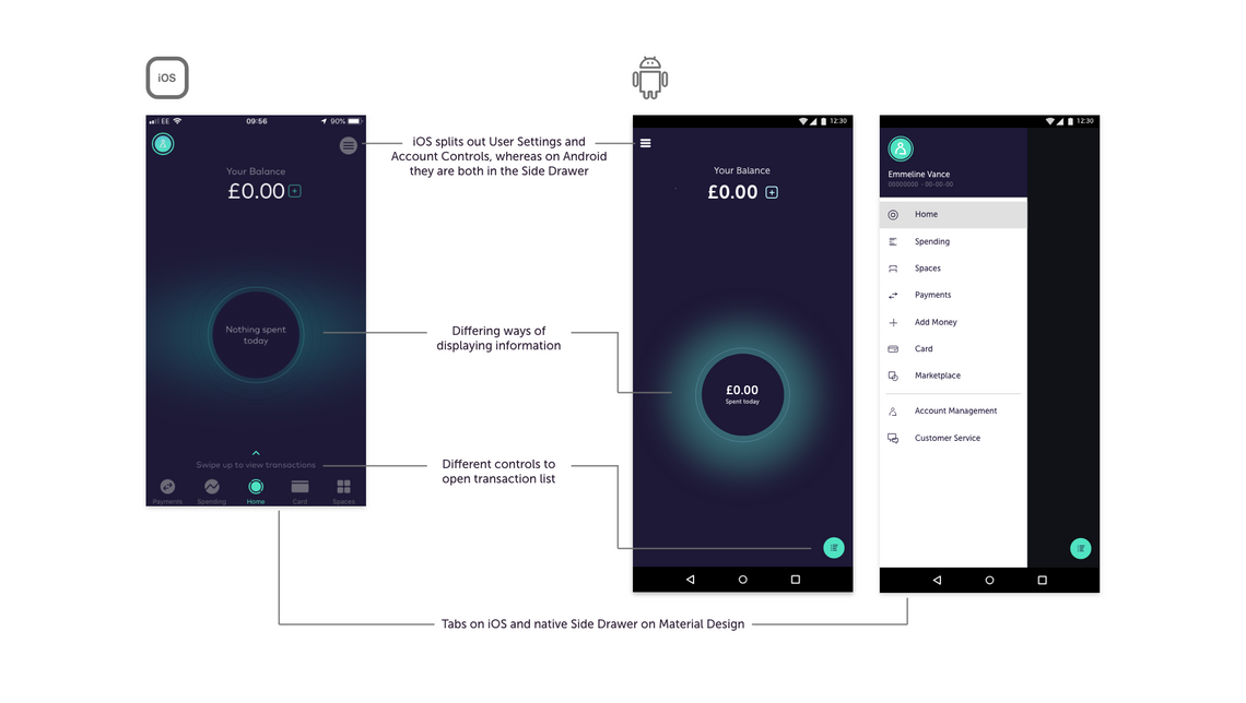
Starling Bank are dealing with the navigation challenge by creating a tailored native approach on each platform. On iOS they use the bottom tab bar to display the main application pages, and move the profile and transaction sections up into the top bar to maintain a slightly different hierarchy between them. On Android, they use a native navigation drawer, which is the preferred component for the main navigation on this platform, and use a floating action button to house the transaction list.
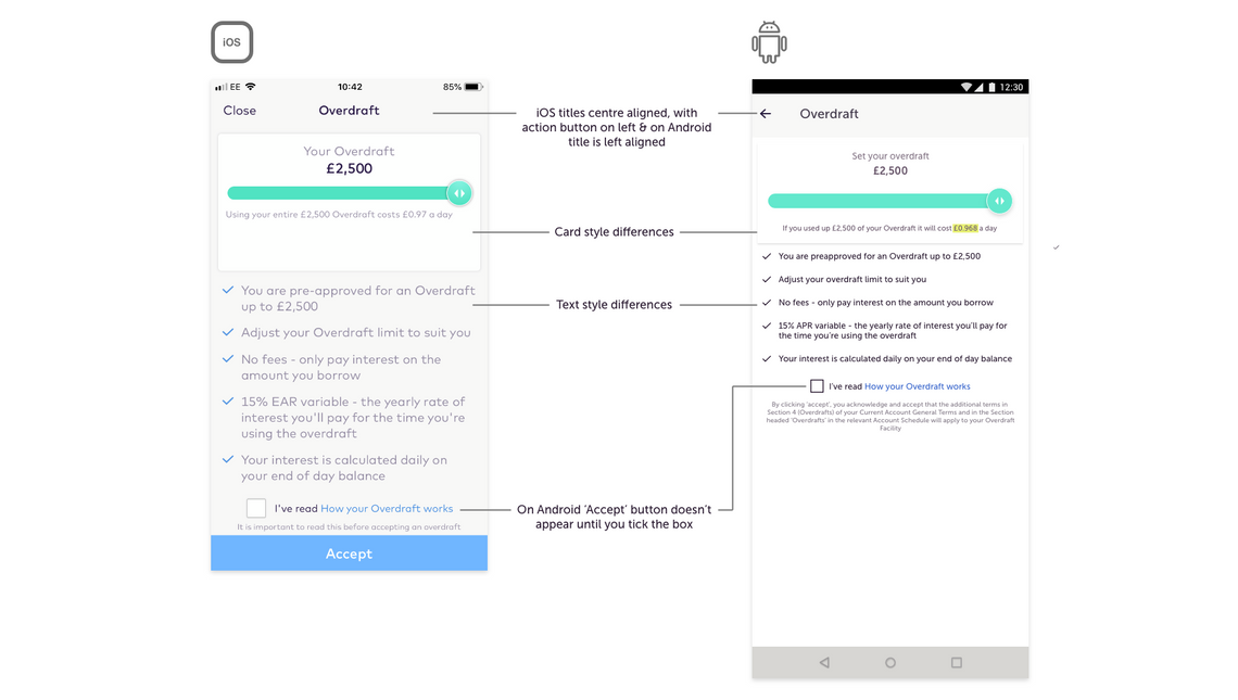
In the example above, Starling Bank has created a custom slider component, instead of using a Native iOS and/or Material Design slider. Although this likely created extra development effort on both platforms, the cost of doing this was evidently deemed lower than the benefit of enhancing their unique visual language on their app. The slider is recognisable as a slider component, so through user testing Starling Bank can determine if both iOS and Android users understand how to interact with it.
Revolut
Revolut is working much more towards the platform parity end of the scale. Their iOS and Android apps appear near identical to each other. Overall the apps have more of a native iOS feel, but there are also examples of custom components and visual style.
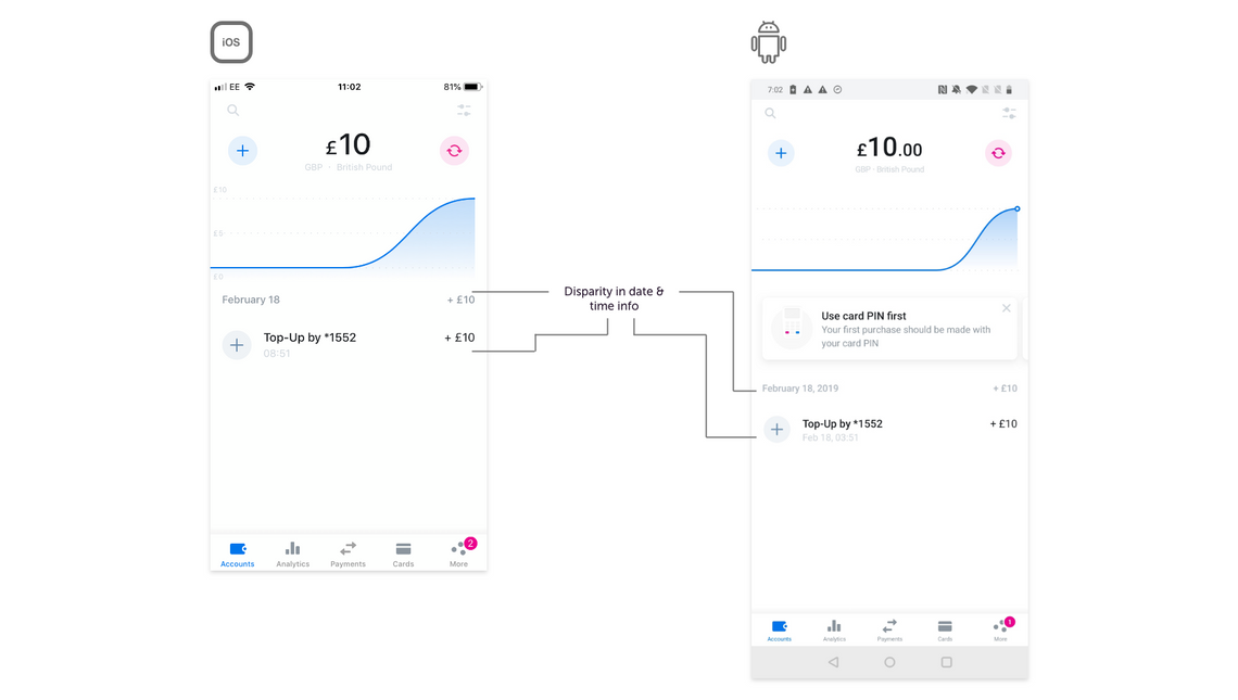
In terms of navigation Revolut have opted for bottom tab bars on both platforms, a similar approach to that taken by Monzo. The card notification visual styling on the Android app has more of an iOS look, with its round corners and heavier drop shadow. As with the Monzo app, there are some small discrepancies between the microcopy, which could be due to the development cycles not being in sync or human error, but overall the screens appear very similar.
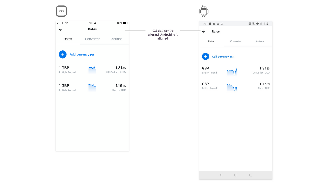
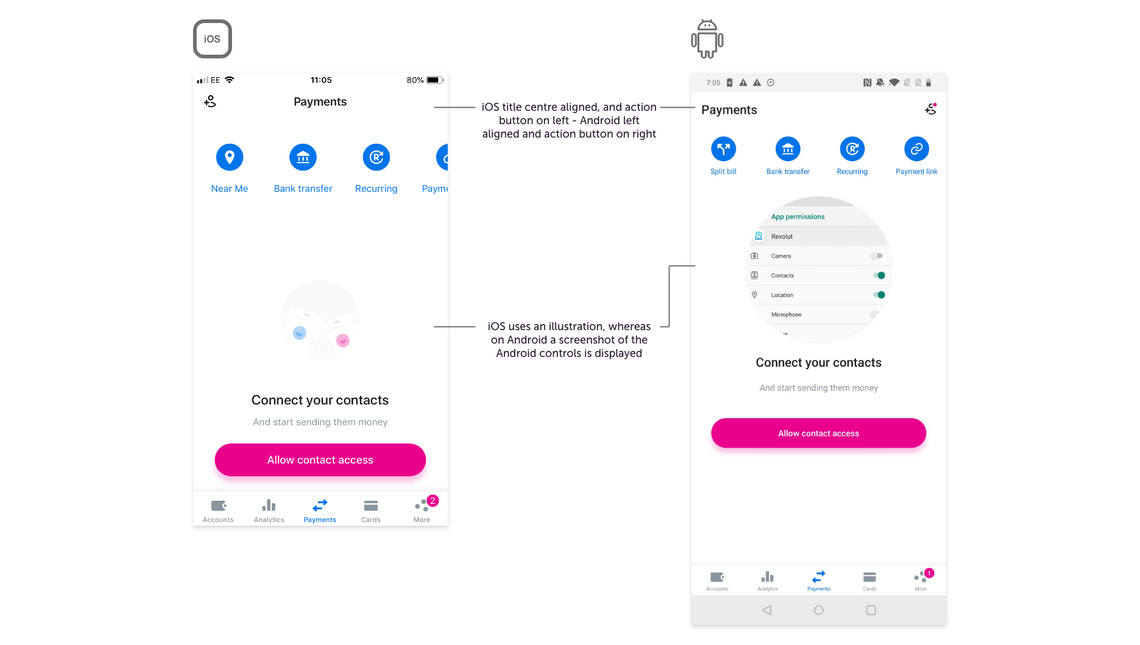
There are however, some small considerations that appear to have been made to the cross-platform differences. On the ‘Rates’ screen the tab view is laid out relative to the native platform guidelines, with the iOS page title centered, and the Android title right aligned. A similar example can be seen below where the ‘Add Contact’ action button is left aligned on iOS and right aligned on Android, again relating to the platform guidelines. These are small considerations, but likely make a big impact on the way users interact with the application based on their familiarity with where components can be found.
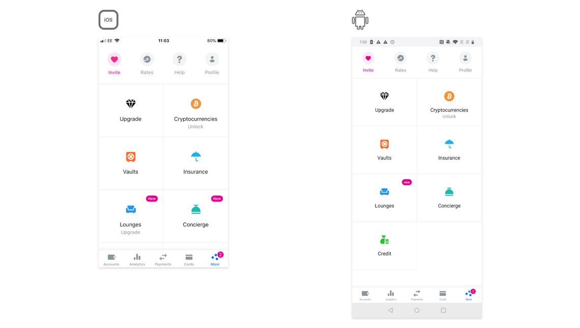
Revolut have also use some custom navigation which doesn’t necessarily relate closely to either of the native guidelines standard components. For example, below in their ‘More’ section, they have a top tab bar, grid-style navigation and a bottom bar in one screen. This may add an additional creative edge, but the usability of the interface should be carefully tested.
These three challenger banks have taken slightly varying degrees of approaches to the issue of cross-platform design, with Monzo edging towards the Platform specific end of the scale, Starling opting for more of a mix of custom and native components, and then Revolut pushing for platform parity.
In order to make well-informed design decisions when it comes to the approach for cross-platform design, we need to first understand the subtleties and idioms of both platforms. With this knowledge we can define a cross-platform design strategy which should result in efficient design and development cycles and an effective app experience.