About UX Scotland 2019
Icebergs ❄️
Scottish weather ☔️☔️☔️
Pizza references 🍕🍕🍕🍕
The 2019 edition of UX Scotland included over 50 sessions and welcomed over 340 visitors to the iconic venue Dynamic Earth in Edinburgh. I recently moved to Scotland (I’m from Sweden, the land of fika and smart storage solutions) and started at Scott Logic. UX Scotland was a fantastic introduction to the UX community in the UK. As a returning sponsor for the event, we invited attendees to create Lego sculptures in response to different prompts over the three day conference. You will see some of the creations referenced throughout this blog as many of them relate to the topics discussed during the sessions. My core takeaways centre around 3 themes:
- Mapping as a design tool
- The significance of emotions in design and communication
- The benefits of focus and silence.
Mapping the way
Kirsty Joan is a full time mapmaker working as a service designer at FutureGov. In her workshop “The importance of mapping - And how to do it well” she shared her love and fascination for maps. Kirsty argued maps are tools we use to make sense of the world we’re in. They show us where we have been and help us decide what to explore next. She went on to say that every map is subjective, and what you choose to include or exclude in the map shapes everyone’s understanding of the space.
Kirsty made me take stock of the different mapping tools designers use. Some are much more complex than others. Storyboards and customer journey/experience maps focus on empathising with the user. User story maps inform us what to build and service design blueprints show us how to support an operational service. What they all have in common is that they usually start with a post-it and a sharpie.
Kirsty stressed that mapping is a collaborative exercise, getting everyone involved is key to success. To achieve this, she likes to keep things “mucky and scruffy”. My main takeaway from her workshop is that maps are tools for collecting team insights and creating a shared understanding. It is important that you make them inclusive and easy to edit and share.
Sophie Dennis’ keynote illustrated how she uses user story mapping and the Kano model to push for quality in her work with the government. With the overall quality of a project being constrained by money, time and scope, as illustrated through the Project Management Triangle, she argued designers are responsible to advocate for quality.
Sophie showed us how she uses user story mapping as a tool to create a common understanding and to get everyone to work towards a common goal. From there, she explained how she uses the Kano model to spark a discussion on how to prioritise features. The Kano model divides features into three different categories: one-dimensional (performance pay-offs), “must have” (basic expectations) and attractive (excitement generators). By doing calculated tradeoffs between the features to focus on those that make the biggest impact on the customer, Sophie argued you can deliver better experiences by doing less. For organising a conference, her example looked like this: - Make sure you have the “must haves” that people expect but don’t necessarily get excited about (e.g. drinking water). - Make sure your one-dimensional factors are good. If they’re not, consider dropping them completely (e.g. having no lunch might be better than having a bad lunch). - Make sure to include some excitement generators that people don’t expect (e.g. cake).
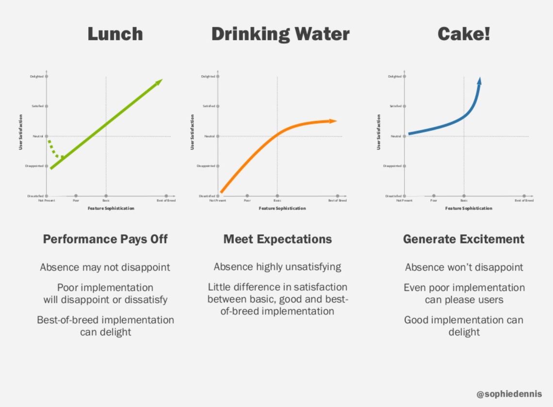
At Scott Logic, we often use story mapping to involve all stakeholders at the beginning of and throughout our projects. It is a great way to get everyone’s perspective and knowledge in the same place and in front of everyone’s eyes. The completed map also serves as a guide on what to focus on for a first release. After learning about the Kano model, I’m keen on exploring how we can apply that to our projects at Scott Logic as a framework for prioritising features.
We need to talk about feelings
Liraz Margalit, head of behavioural research at Clicktale, talked about how emotions play a major role in decision making and brand loyalty in her keynote “How do emotions shape brand experiences?”. She talked about how different emotions drive memory creation in our brain and how memories affect our snap decision making. Liraz explained that neutral experiences do not form strong memories while highly emotional experiences (positive or negative) creates stronger long lasting memories.
One of her key points is that we should strive to reduce the negative experiences and amplify the positive ones in our products to create positive brand memories. The most important lesson from her talk was to focus more on the parts of the product that elicit the strongest emotions since they make a greater impact on the customer. This is also in line with Sophie Dennis’ keynote.
At another talk, Emma Craig tackled the messy topic of emotions and feelings and how to apply that knowledge when interviewing users. As a UX Research lead at Shopify, Emma has explored lots of different ways to measure people’s emotions. She has experimented with everything from emojis to biometrics, but seems to prefer the old fashioned method of asking people how the feel.
In her talk, Emma provided a practical and thoughtful approach to connecting deeper to your research participants. She highlights the importance of empathy when conducting user research. Drawing on her experience as a yoga teacher, she described the concept of “holding space”, the act of being present with someone without judgement. According to Emma, practicing empathy requires holding space for a person as well as for yourself.
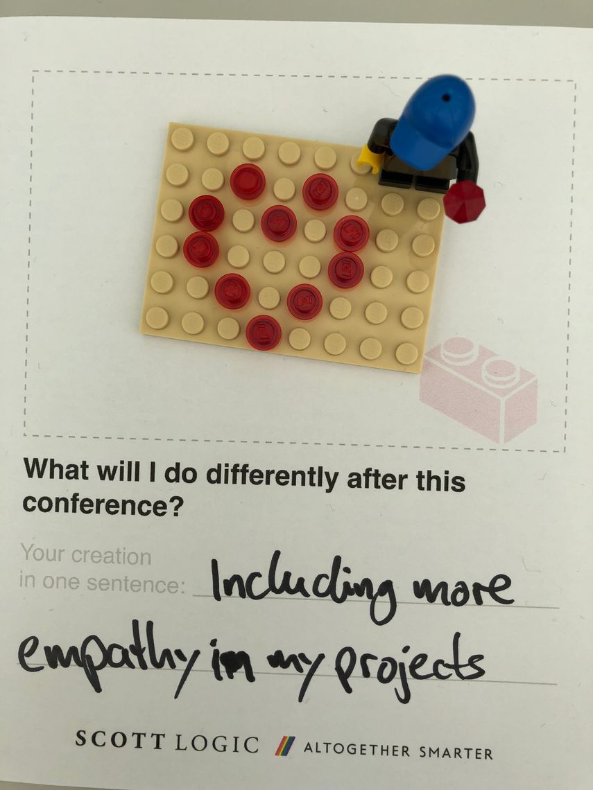
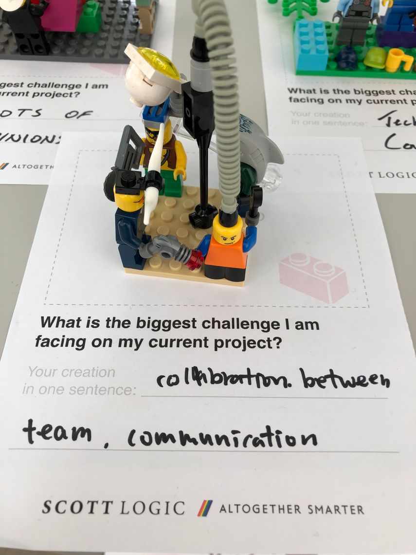
Emma also talked about the concept of nonviolent communication. It is a method based on the belief that all humans share the same basic needs, and that conflicts arise when strategies for meeting those needs clash. In practice, it is a way of communicating in which you refrain from moralistic judgements. Instead, you focus on compassion by trying to understand the underlying needs and feelings of the person you are interacting with. I liked the way Emma used the technique to reframe user research findings in a more constructive way. This method made it easier to take the perspective of the user and empathise with them.
Emma’s talk was a good reminder of the importance of accounting for people’s feelings when doing user research. Emma offered a useful approach to dealing with these situations taking into account the needs of the user as well as the needs of yourself. Going forward, I’m curious to learn more about holding space and nonviolent communication to create deeper connections with the people around me.
Focus, depth and silence
Our own Simon Duncan, Lead UX Designer at Scott Logic, did a talk on “Practicing Depth” inspired by Cal Newport’s book ‘Deep Work’. At Scott Logic we often deal with complex, data heavy applications. A strong ability to focus is important to understand and make sense of the contexts we design for. In his talk, Simon discussed the implications for deep focus in a connected workplace with distractions such as instant messages and open plan offices. He also offered some guidance on what we can do to practice depth as well as the benefits it can bring.
One great quote in the presentation is from the author of ‘Flow’, Mihaly Csikszentmihalyi: “Control of consciousness determines the quality of life”. We know a lot about how to take care of our bodies, but perhaps less so about taking care of our mind. Simon explains that “Focus is a muscle, not a switch” and that it takes deliberate practice to get “ripped”. Achieving deep work is a mixture of self knowledge of how you work best, removing external distractions, planning and protecting your time, keeping a scorecard on your progress as well as being accountable for delivering your work on time.
For me, the most compelling argument for deep work is that it is an activity well suited to generate a state of flow. Mihaly Csikszentmihalyi has described the state of flow as “being completely involved in an activity for its own sake” where “nothing else seems to matter”. He argues that having flow experiences naturally leads to a more fulfilled and meaningful life. I think the benefits deep focused work can bring is a powerful motivator to be more mindful of how we spend our attention and time - in everything we do.
The most memorable experience I had at the conference (except touching an iceberg during the guided tour of Dynamic Earth) was the workshop “Psst! Silence: a great collaborator” led by Ajara I. Pfannenschmidt at nagare. We entered the room quietly and waited for all participants without talking to anyone. The task was to build a doodling robot with the two other people that sat at your table, in complete silence. Whenever you had something you wanted to say, you were instructed to write it down on a post-it. By the end, all teams had managed to successfully build their robots as well as give them some flair.
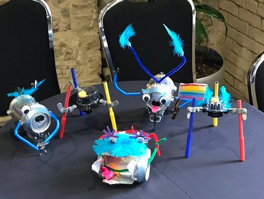 Photo cred: Ajara I. Pfannenschmidt
After the silent collaboration session, there was a group discussion with the whole room. One reflection everyone seemed to have was how well the team collaborated without speaking a word. Sure, we all had some frustrating moments when we wanted to say something, but we managed to complete the task despite that. And, looking back at the post-its I wrote, I realised the things I wanted to say weren’t that important.
Another key takeaway was how inclusive silent collaboration is. Our group intuitively ended up taking turns building and checking the instructions. By eliminating speech, it’s no longer only the loudest voices being heard. This benefits introverts (myself included) who may have a more cautious approach to group participation. Against expectations, not speaking caused us to pay greater attention to each other. This built an intense focus on the task.
This experience proved to me that there are many benefits to silence and that we should in fact try to make more room for it in our professional and home lives. This may resonate louder if you have participated in a design sprint. If so, I’m sure you can agree that silent ideation and sketching often is much more effective than discussions. They are for example more inclusive in that they allow people to work in parallel. This lets more of a team’s expertise shine through. A similar example is silent meetings that have become popular at Amazon and Twitter. Silent meetings centre around a written “table read” that all participants read and comment on in silence. A meeting facilitator helps synthesize comments and facilitate discussion. Personally, this meeting structure sounds more compatible with how I take in and process information, so I’m very interested to learn more and see if I could apply it to meetings in the future.
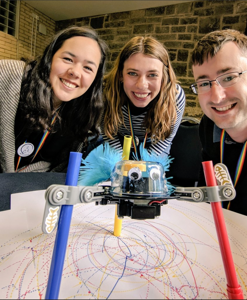 Photo cred: Michael Crabb
Thank you
Thanks to all the speakers as well as the ones I haven’t mentioned here. I met a lot of friendly people and left the conference with new practical tools and inspiration on how to develop my design craft. My main takeaways were the importance of mapping, the significance of emotions for decision-making and communication, the benefits of practicing depth as well as making more room for silence. And that you should always end things with cake 🍰!


