This post explores my experience optimising a web app through iterative improvement. The app uses Svelte, but you don’t need any prior experience, and most of what I discuss applies to any web app.
It follows on from Embrace your Obsessions! so if you want to learn more about Minesweeper and the context of this post, give it a read.
After my NE:Tech talk, I was upset at how slow Minesweeper Constrained was, especially when its auto-solver was enabled. Trying to solve a 10x10 board would result in the app freezing for a few seconds, and anything bigger than 15x15 would probably crash the tab.
Now, I could’ve just optimised the React-Redux version. I knew exactly why it was slow and how to fix it - but where’s the fun in that? Instead, I decided to learn Svelte, an up-and-coming web framework that puts performance first. Svelte code adds extra features and syntax to JavaScript, as well as changing the meaning of some default JavaScript syntax. It doesn’t add any runtime libraries to your site, meaning less overhead and smaller page sizes. Instead, it sits in your build pipeline transpiling your Svelte code to plain JavaScript. In this sense, it is similar to Babel and TypeScript.
All related code is stored in the GitHub repository. You can try each iteration of the app on my website.
Rewrite it in Svelte
The app is very simple, displaying a 100x100 Minesweeper board and automatically solving it. The board visually updates as the solver progresses. The algorithm is basic and often gets stuck on boards that humans could easily solve. It applies the same rules as the solver in Minesweeper Constrained:
- If a clear cell already has all of its surrounding bombs revealed, clear the unknown cells around it.
- If every unknown cell around a clear cell must be a bomb to reach the number, flag them all.
The app looks like this:
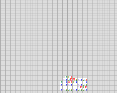
You probably noticed that only a small portion of the board has been solved. It’s not that the solver got stuck, I just got bored of waiting. I’m grateful that it didn’t crash my browser, but we have to admit that it’s not very fast. The ‘performance’ tab of Chrome’s developer tools reveals that it topped out at 1.9 fps. It was around this time that I realised rewriting in Svelte didn’t automatically make my app fast. I would still need to do some optimisation.
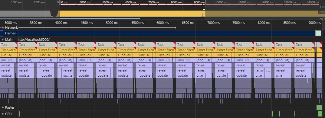
In the below screenshot of the browser’s developer tools, we can see that the app spent 6 seconds processing the solver before outputting one frame.
The app’s slowness can be attributed to the JavaScript, represented in yellow and blue, which took a very long time to run.
Specifically, most of the time was spent running the update function, which is part of Svelte’s global state management.
If we want to improve the speed of the app, we need to look there.
Snapshots:
Derive Bottom-Up
Before we start our deep-dive optimising the global state management in the app, we need to understand how Svelte deals with global state. Like Redux, Svelte holds its data in stores that can be subscribed to. When a store’s value changes, any components subscribed to that store are re-rendered.
We can also use the derived function to create a new store based on the values of our existing stores.
It takes two parameters:
- The list of parent stores that we are deriving from
- A function that calculates the value of the derived store based on the parent values
For example, a derived store that adds the values of its two parent stores could be declared using:
const added = derived(
    [store1, store2],
    ([$store1, $store2]) => $store1 + $store2
);
Whenever the value of any parent store changes, the value of the derived store is recalculated. If the calculated value is the same as before, nothing happens. However, if the value has changed, then the derived store will trigger its own update and the process will continue down the chain to its subscribers.
I used derived stores constantly in the app. The diagram below shows a rough outline of how I handled global state.
- Components (things that actually appear on the page) are shown as hexagons
- Stores are shown as rectangles
- Subscriptions to stores are shown as arrows.
- The direction of the arrows show the direction of data flow
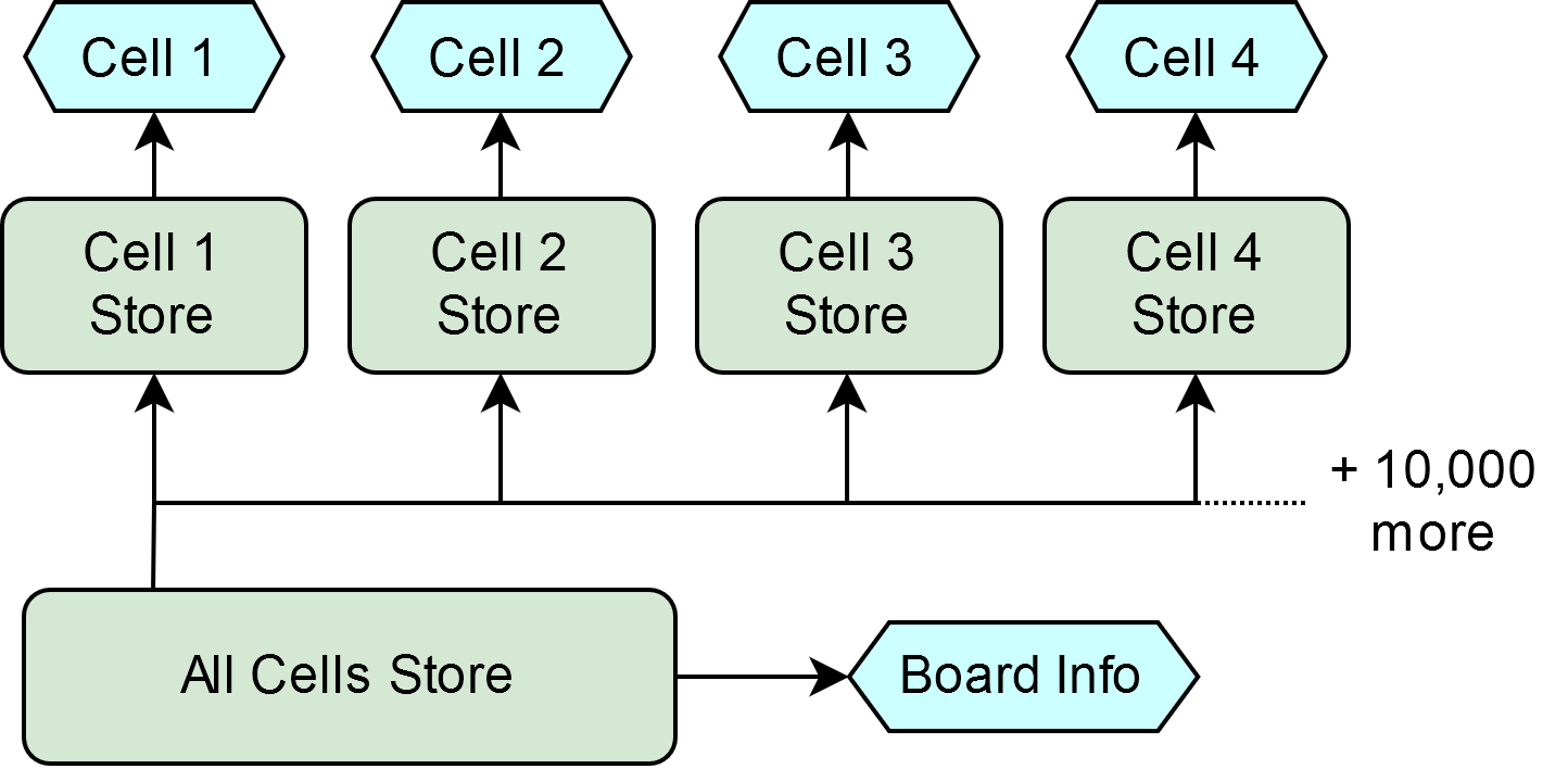
This pattern made it simple to update the global state. There was one large store which acted as the source of truth. Any changes to the state of the board got sent to the main store. The change filters through the derived stores to the cell components.
Below is an animated version of the above diagram. It demonstrates how an update filters through the dependency network. Any node shown in red is one that had to be checked to see if it had changed.
When Cell 1 was revealed, the app sent an update to the main store. Since the value of the main store had changed, each derived store had to be checked to see if their value had been affected. We know that only Cell 1 had changed, meaning only the component for Cell 1 actually needed re-rendering. All of those checks were pointless!
In small projects, that’s not really a problem. This app has over 10,000 derived stores and (eventually) 60 updates per second. In our case, it is a problem.
We have a single large top-level store, and we derive multiple smaller stores by extracting a slice of that large state. I call this pattern Deriving Top-Down. The inverse of this is Deriving Bottom-Up, where we derive a large store from multiple small stores each containing more specific information. If you’re confused about the ‘Bottom-Up’ name, consider a pyramid of stores:
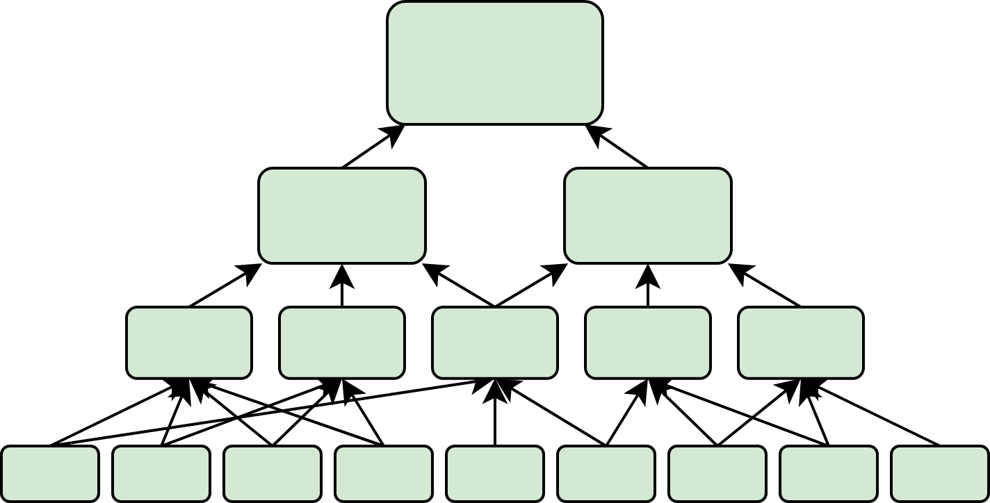
When the arrows are pointing from the bottom to the top, we are deriving the large stores from the small ones. Since the arrows are pointing from the bottom upwards, we are deriving bottom-up.
In my app’s diagram, making the switch just reverses the dependencies between the large store and the per-cell stores. Rather than deriving per-cell stores from the large store, we derive the large store from the per-cell stores. The per-cell stores now act as the source of truth for that cell’s state.
To reveal Cell 1, we now send the update to the Cell 1 store:
By Deriving Bottom-Up, we prevent 9,999 unnecessary checks!
There are downsides to deriving bottom-up. Any action that updates multiple small stores becomes more complicated. In my app, I had to create functions to abstract away from the individual stores and update multiple stores with one method call.
Results
Changing the structure of the global state to derive bottom-up instead of top-down produced a 1126% speedup, meaning the app now runs at 23.3fps. In developer tools, we can see that the JavaScript runs much faster, meaning the limiting factor is now the time to compute the HTML layout:
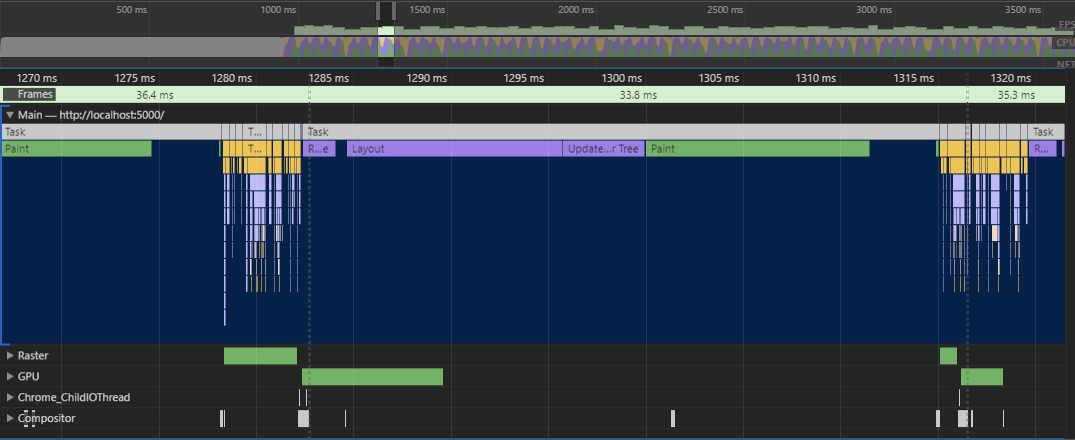
In this image, it looks like the layout is suddenly much slower than before. However, nothing has changed, we are just more zoomed in since the app is running at a much higher framerate.
Snapshots:
Stop Unnecessary Layouts
At this point, we have to enter the scary world of HTML Optimisation. There’s no point optimising our Svelte code more when it won’t make a noticeable difference. As shown in developer tools, the app spends lots of time computing the HTML layout of the page. This step in the rendering pipeline decides where each node should appear on the page, calculating their position and size.
When the solver reveals a cell, it adds text to it - a number (if clear) or an X (if flagged).
This causes the browser to think the cell might have changed position, as adding a new node to the grid would usually cause every other node to shift along one.
Since the text is overlaid on top of the cell, we know that it won’t cause any changes to the layout.
However, the browser isn’t clever enough to know that.
Thanks to our good friend Google, I found some really helpful documentation on what triggers a layout. There is a whole set of CSS properties that can be changed without triggering a layout, including the colour of text and backgrounds.
Since the app knows what text will be displayed in each cell once revealed, it can simply add the text at the start with color: transparent (check your target browser’s compatibility).
Then, when the cell is revealed, the colour can be changed to make the text visible without triggering a layout.
Results
Preventing the layout step resulted in a respectable 57% speedup, allowing the app to reach 36.5fps. In developer tools, the once-painful layout step is nowhere to be seen. The new priority is the paint step, shown as the really long green bar below:
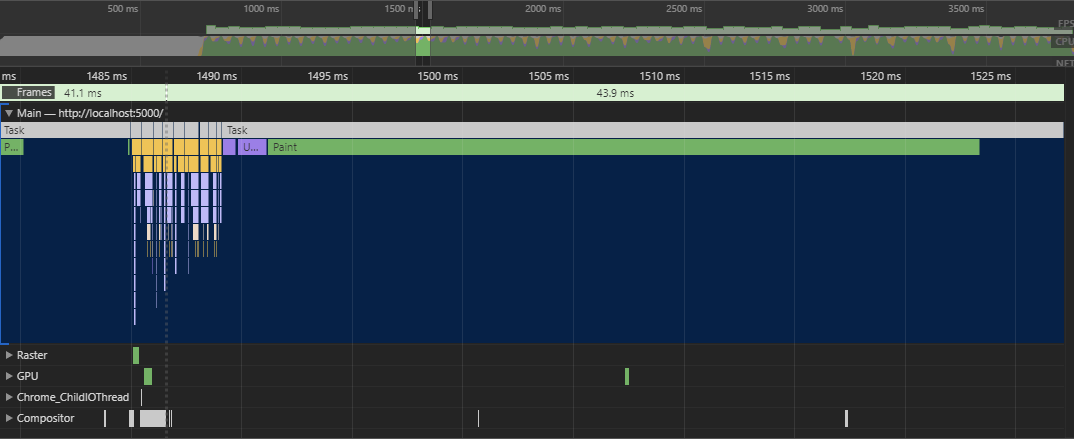
Snapshots
Paint Less
So why does painting take so long?
Each frame, we need to paint an 800x800 pixel area. Eventually, we want to be able to do that 60 times per second. That’s a big ask to begin with, and it’s even worse when you consider the number of paint commands being executed.
For each cell, we need to paint:
- The background
- The border
- The text
That’s 30,000 paint commands, and it gets slow. We can see them using Chrome’s advanced paint instrumentation:
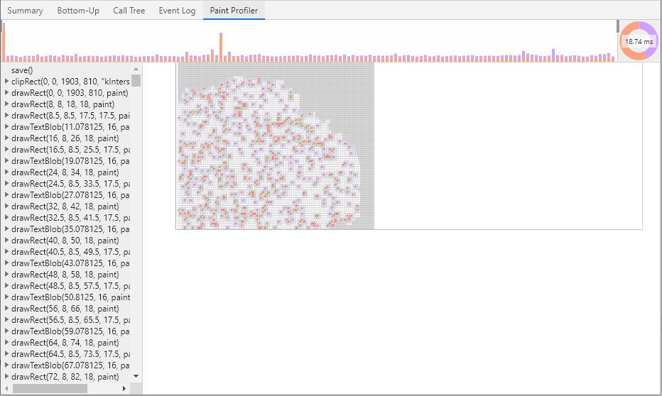
Immediately, I see that we could remove the borders. That would reduce the number of paint steps for each cell from 3 to 2. We could replace the cell borders with a checkerboard pattern in the background.
Subjectively, it doesn’t look as nice, but we only care about performance!
Results
By simply removing the borders, we see a 37% improvement to 50.1fps. The developer tools look remarkably similar to last time. Despite reducing the number of paint steps, that stage of the rendering pipeline is still the slowest.
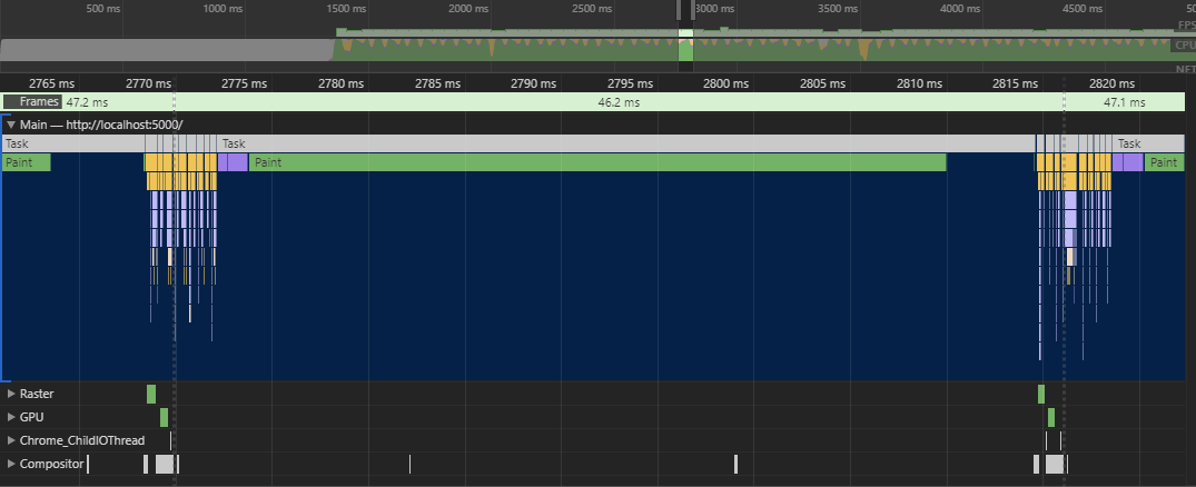
Snapshots
Skip Transparent Text
Every time there is a 0 or an unknown cell, we paint a transparent number.
Instead of using the transparent colour, we could use opacity: 0 and will-change: opacity (check your target browser’s compatibility).
When we set opacity instead of color, the browser knows not to paint the invisible text.
By setting will-change: opacity, we tell the browser not to waste its time performing a useless layout pass, since all we change is the text’s opacity.
However, setting will-change causes the browser to split each cell into its own layer, resulting in 10,000 layers on the page.
This is incredibly slow since the layers need to be combined together before rendering, in a step known as layer compositing.
We’ll just have to tolerate that the app paints transparent text, since the layers are just too slow. Well, they’re slow if we have too many…
Split into layers
When rendering a frame, the app paints the entire board, even though only a few cells have changed. It would be more efficient if we could re-use the previous renders for the parts that haven’t changed.
We can do that by splitting the board into sections using layers. Then, any layers that haven’t changed don’t have to be re-painted and the old version can be reused.
Adding too many layers can cause slowness during compositing, so we can’t go too extreme. I found that the sweet spot was around 100 layers, each containing 100 cells. Each of these layers was 1% the original size and therefore roughly 100x as fast to paint.
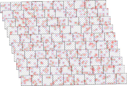
Layers can be any rectangular shape, and the goal is the minimise how often a change affects multiple layers. In our case, since cells affect each other in all directions, I chose square layers. If cells only affected each other horizontally, we could use long rows instead.
To create these layers, I replaced the 100x100 grid of cells with a 10x10 grid of containers.
Each contained a 10x10 grid of cells, and was placed in its own HTML layer by setting z-index.
I added backface-visibility: hidden to the containers which is designed for rendering 3D scenes in the browser.
This was a bit hacky, but disabled some browser optimisation, forcing it to respect the z-index value and put the node in its own HTML layer.
Results
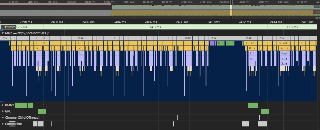
Finally, we hit our goal of running the app at 60fps! In developer tools, we can see that the paint step has been split into multiple shorter paint steps, each handling one layer:
All was well in the world - until I tried it in Firefox…
As it turns out, Firefox isn’t nearly as optimised when it comes to rendering layers. In fact, splitting the board into layers had only made it slower. The app was sitting at around 30fps.
Snapshots
- Source Code
- Code Changes
- Live Version (spoiler - use Chrome)
Use Canvas
The HTML rendering pipeline is very efficient, given that it needs to render arbitrary HTML. However, our last few optimisations have focussed on rearranging our code to convince the renderer that its checks are unnecessary. It’s not that the renderer is bad, it’s just that we know more about our app and what it displays.
For example, we know that none of the cells ever move around the screen, meaning the layout is static. We also know that none of the cells overlap, and that cells are always opaque. The renderer doesn’t have any of that contextual knowledge.
Using HTML5 Canvas, we get full control over the renderer, letting us specify exactly what paint steps to use. This lets us factor in our contextual knowledge about the app. We can skip painting transparent text, and we can just paint the cells that have changed.
Since the app is a static, non-interactive grid, it’s simple to generate the paint steps. Our canvas code is along the lines of:
when a cell is created or updated:
    calculate the pixel coordinates for the cell
    fill a fixed-size square in background colour
    if cell state known and text != "0":
        draw the text in text colour
Notice that the board is never cleared, we simply paint over the top. We know this is safe to do because the cells are opaque and never move or overlap.
Results
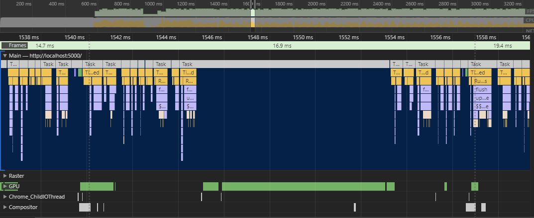
Using Canvas, we now hit 60fps in both Chrome and Firefox. In developer tools, we can see that the paint step has now been offloaded to the GPU, and there’s no layout or layer composition steps.
Currently, we still have the Cell components, but their job is just to paint on the canvas. We could improve performance by just having one controller that handles rendering. I’m not going to do that though.
Technical debt is inevitable when doing this kind of iterative process. My original goal was to learn Svelte, and ignoring 90% of its features in the name of performance makes that a bit pointless.
Snapshots
Conclusion
I achieved everything I set out to do! My app ran at 60fps, I understood the browser’s rendering pipeline, and I learnt Svelte.
If you learn anything from this blog post, let it be this:
- Svelte is good but it doesn’t make you good
- Browser rendering is well-documented magic
- Simple things are simple with HTML Canvas
If you’re interested in my first real project using Svelte, check out MuseTree: a Human-AI collaborative music tool

